A Fresh Coat

bedroom makeover

BOHO BEDROOM REVAMP-The College House

Teen Girls RoomJenny SulpizioComment

Prior to the purchase of this Lubbock home—and after viewing the online pics,—we knew there would be a number of issues we would have to address upon closing escrow. After all, it’s an older home (1960’s), and has seen a slew of owners in its day.

We knew a fresh coat of paint was needed both inside and out, new appliances were in store, just as some of the quirkiness/oddities would have to be dealt with, and improvements made.

A number of these projects have happened simultaneously. From the media room (not completed yet), to the kitchen, family room, guest bathroom, and my daughter’s bedroom, each and every inch of this home is getting an upgrade—-one trip to Texas at a time. Haha.

And this last visit, my daughter’s room finally got checked off the punch list.

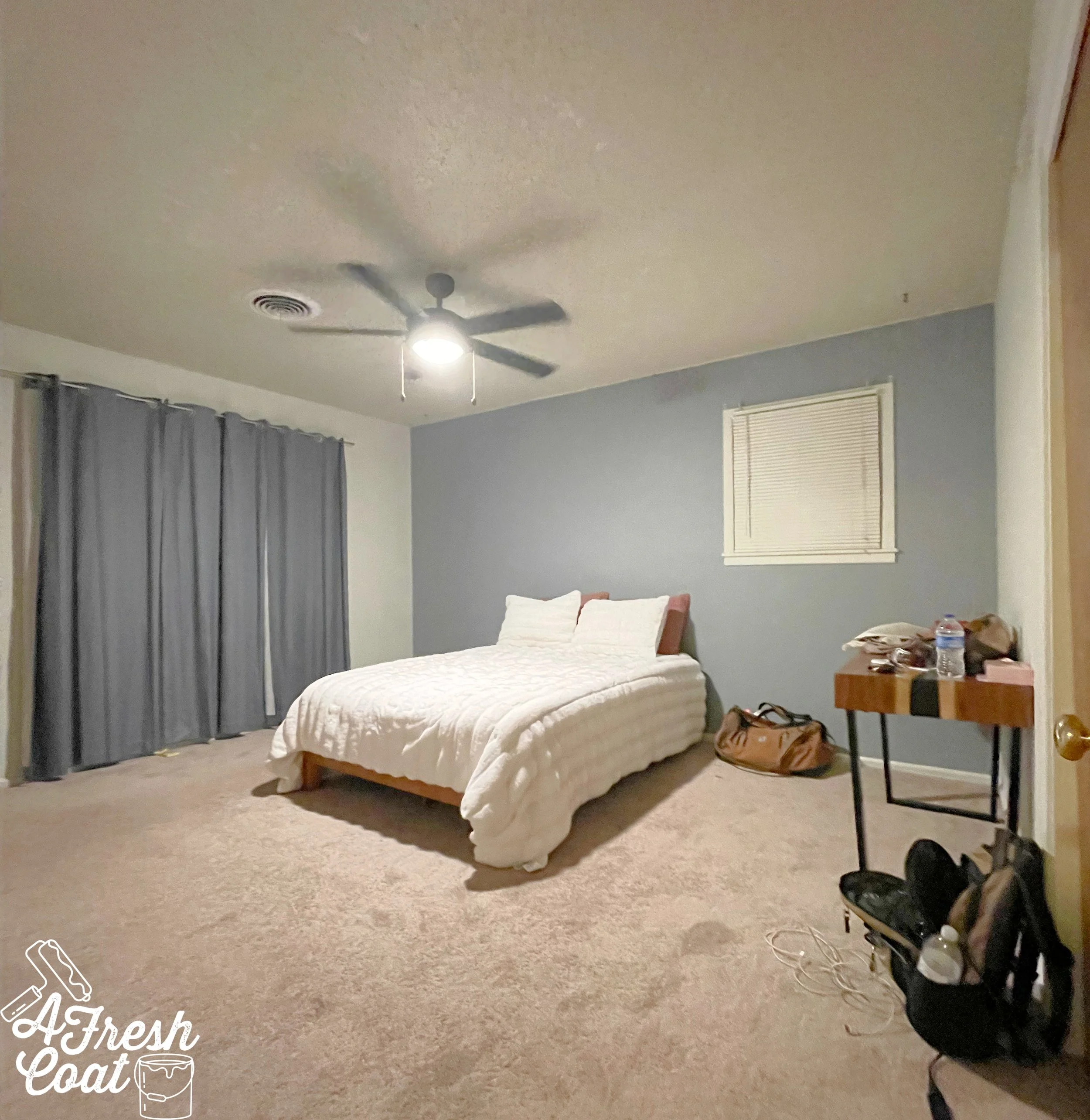
Here is where we started:

Okay, so this room wasn't that bad to begin with. Sure, it wasn’t cute but it wasn't crazy ugly either. However, our goals for this space included repainting the entire room, adding a feature wall detail, bringing in new draperies, and infusing this area with a Boho vibe along with some feminine flair.

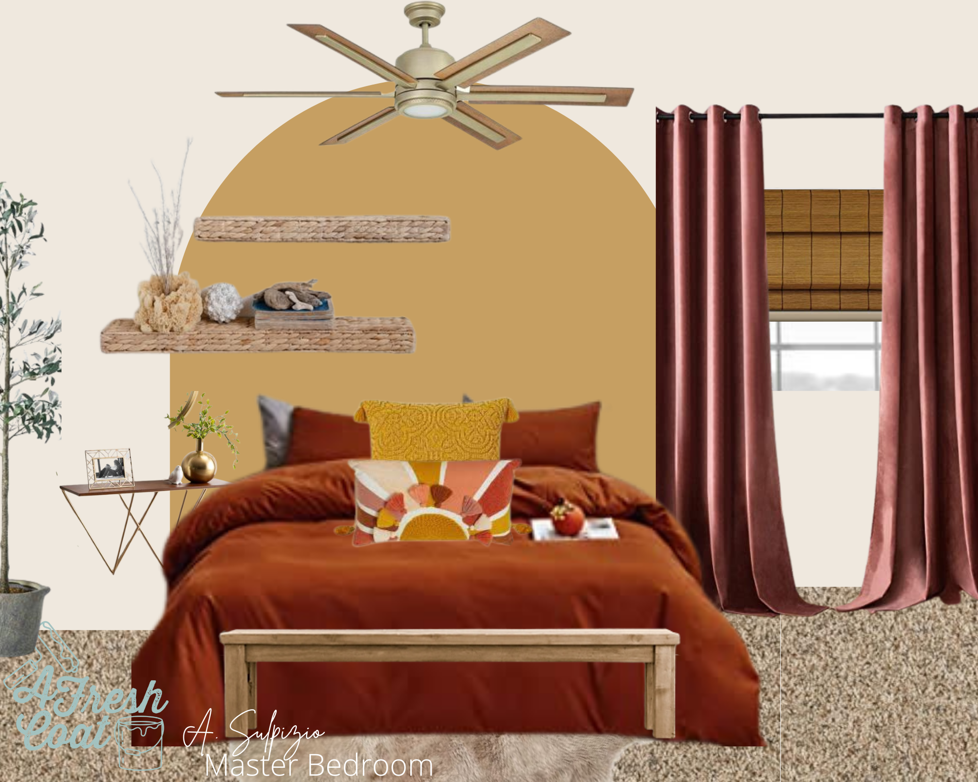
And we started with the vision board.

Beautiful warm colors, rich textures and a Boho style that is all sorts of fun. But before any of the decor could be added, the painting needed to take place.

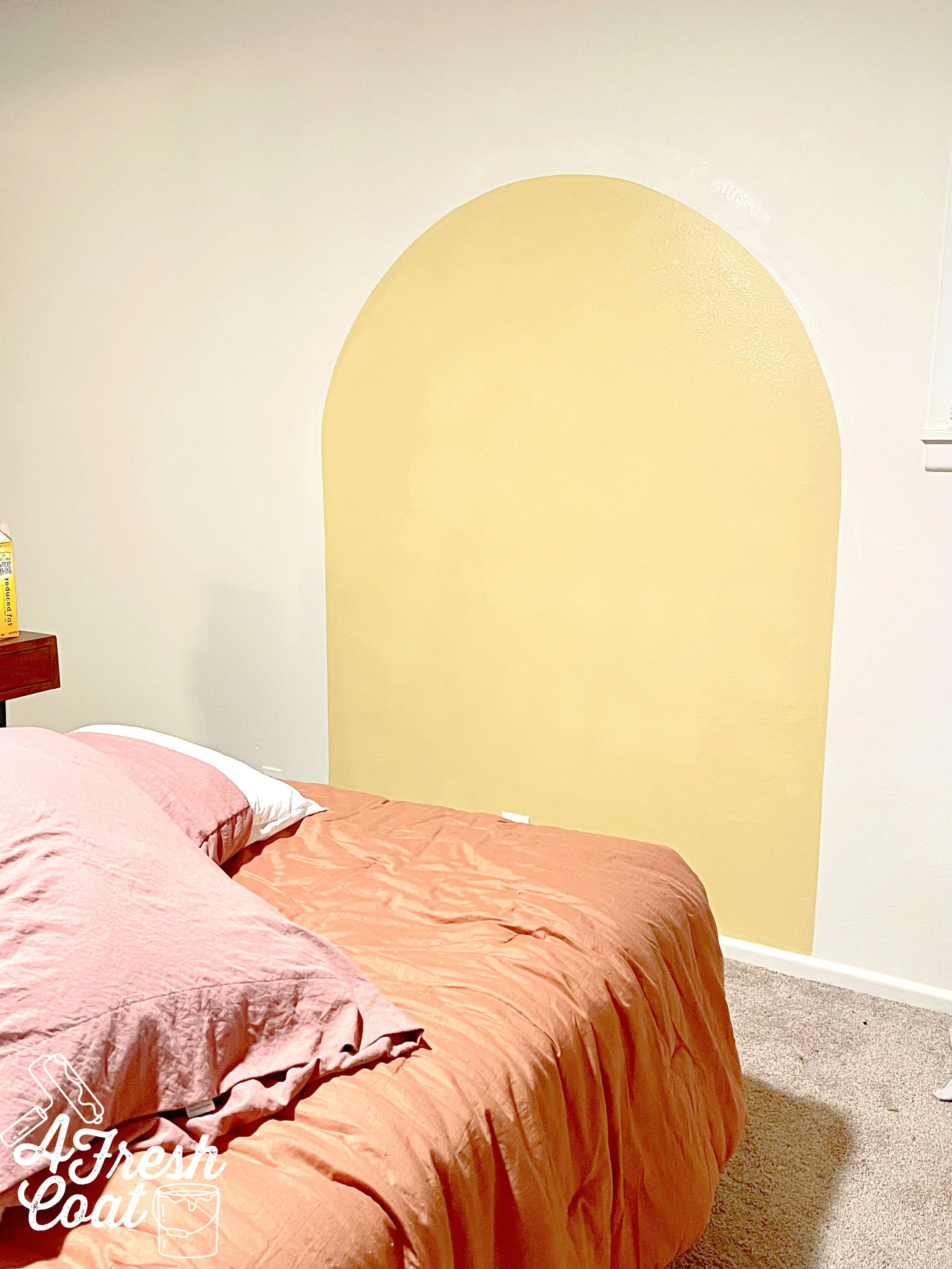
Using Sherwin Williams Creamy, the entire room got painted (thank you, Kari Lynn), which helped to lighten and brighten this room. Next, came the arch. In lieu of a headboard, my daughter, Annie wanted this arch, painted the same width as her double-sized bed.

Once this baby was painted and the old ceiling fans and blinds were changed out, it was time to decorate. This is always my favorite part…always!

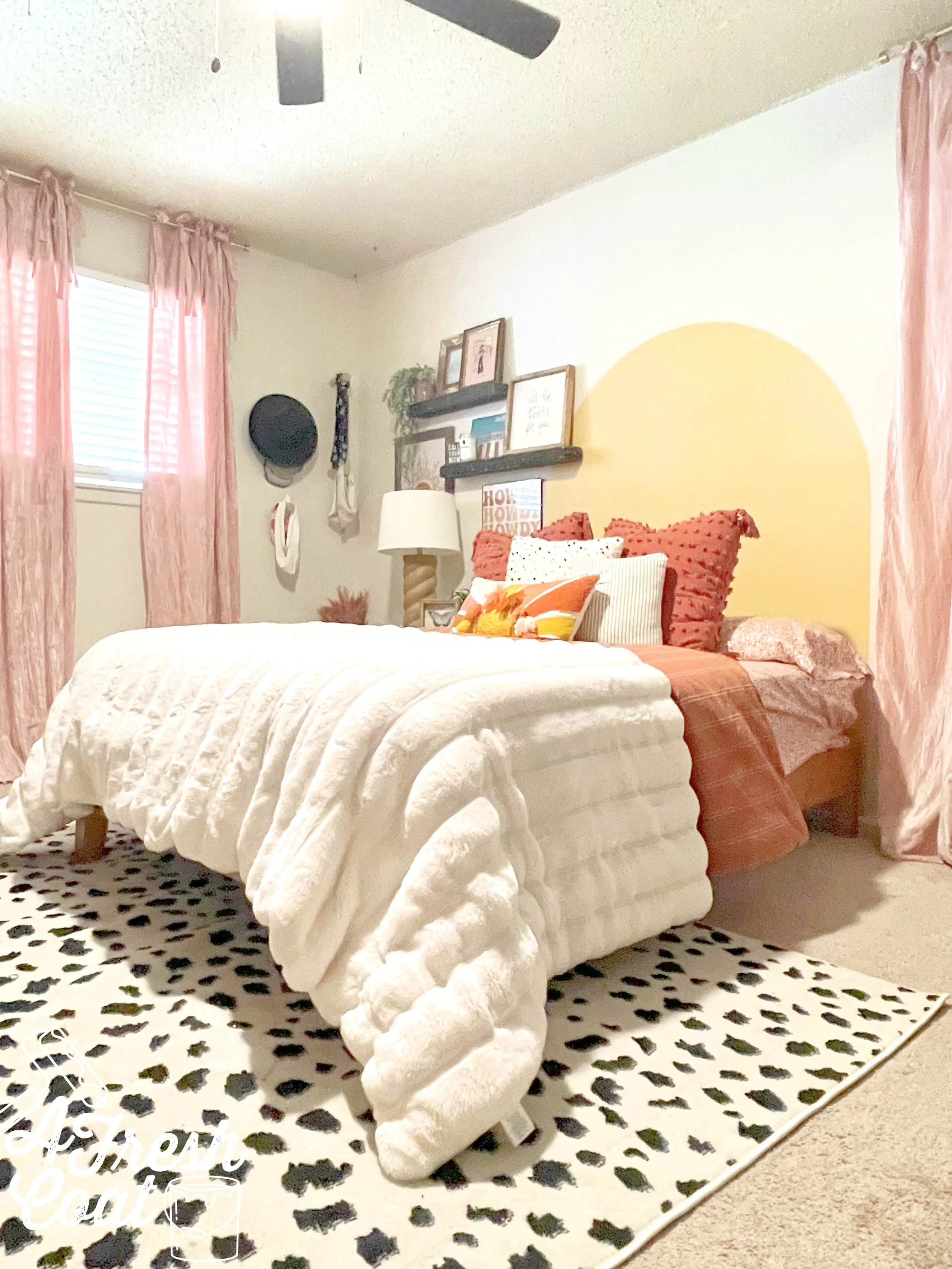
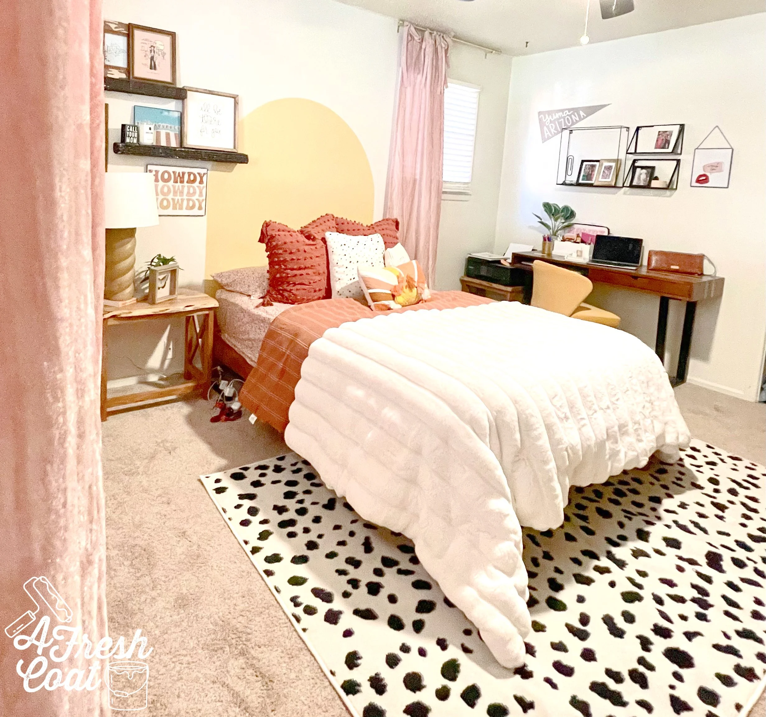
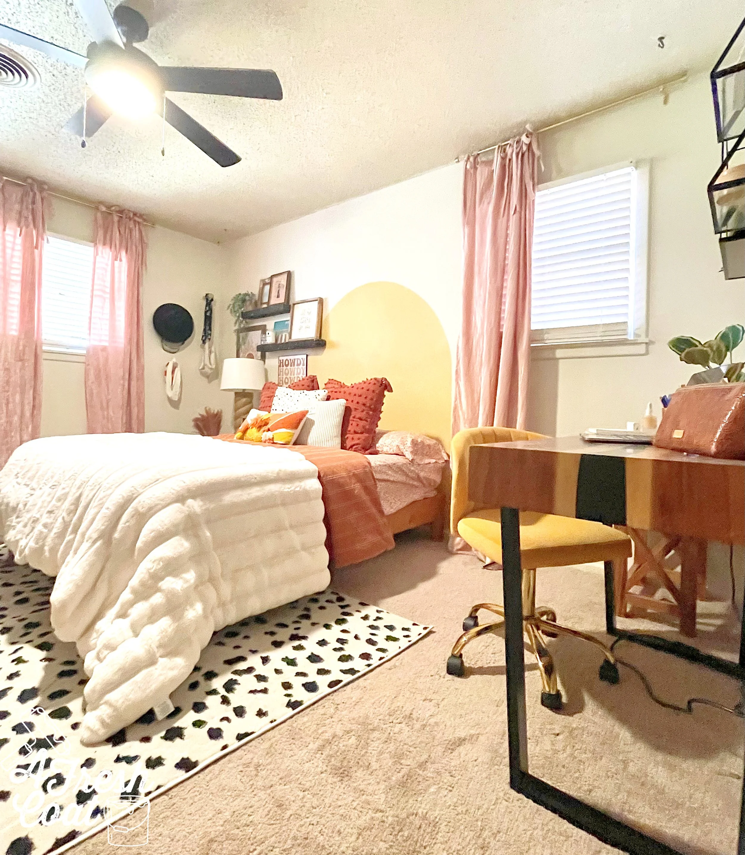
But rather than ramble on and on, here’s the finished product along with all the details below.

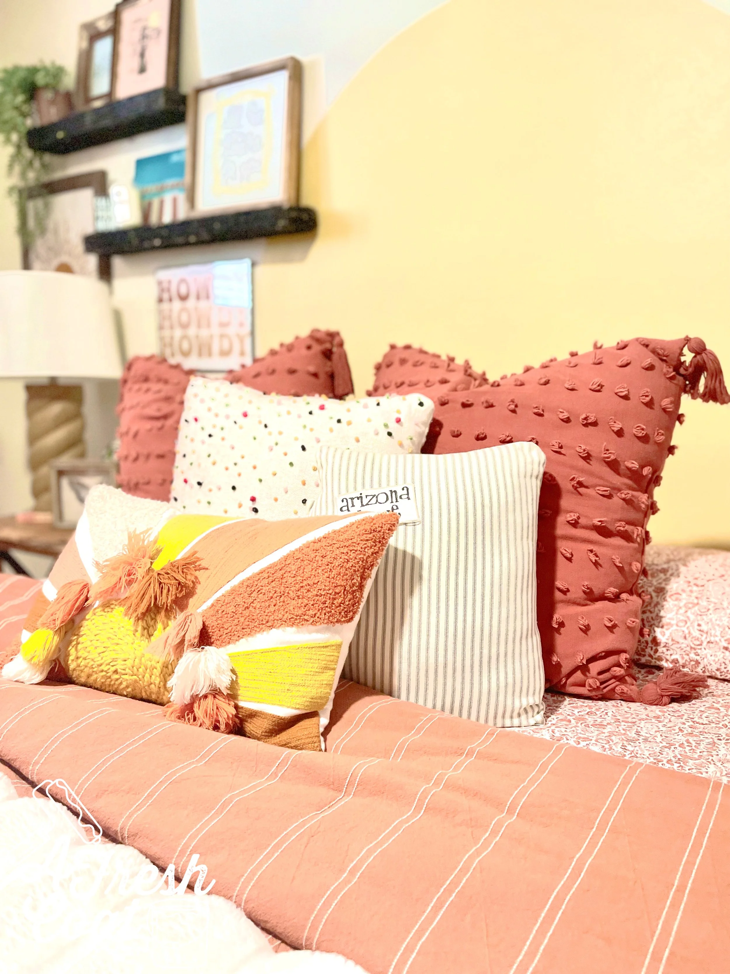
A mixture of colors, textures, and patterns work together to bring a fun Boho vibe to this space.

What’s a girl’s room without throw pillows. A mix of these babies from Target and Dandy Home & Ranch tie every element (and color) of this room together.

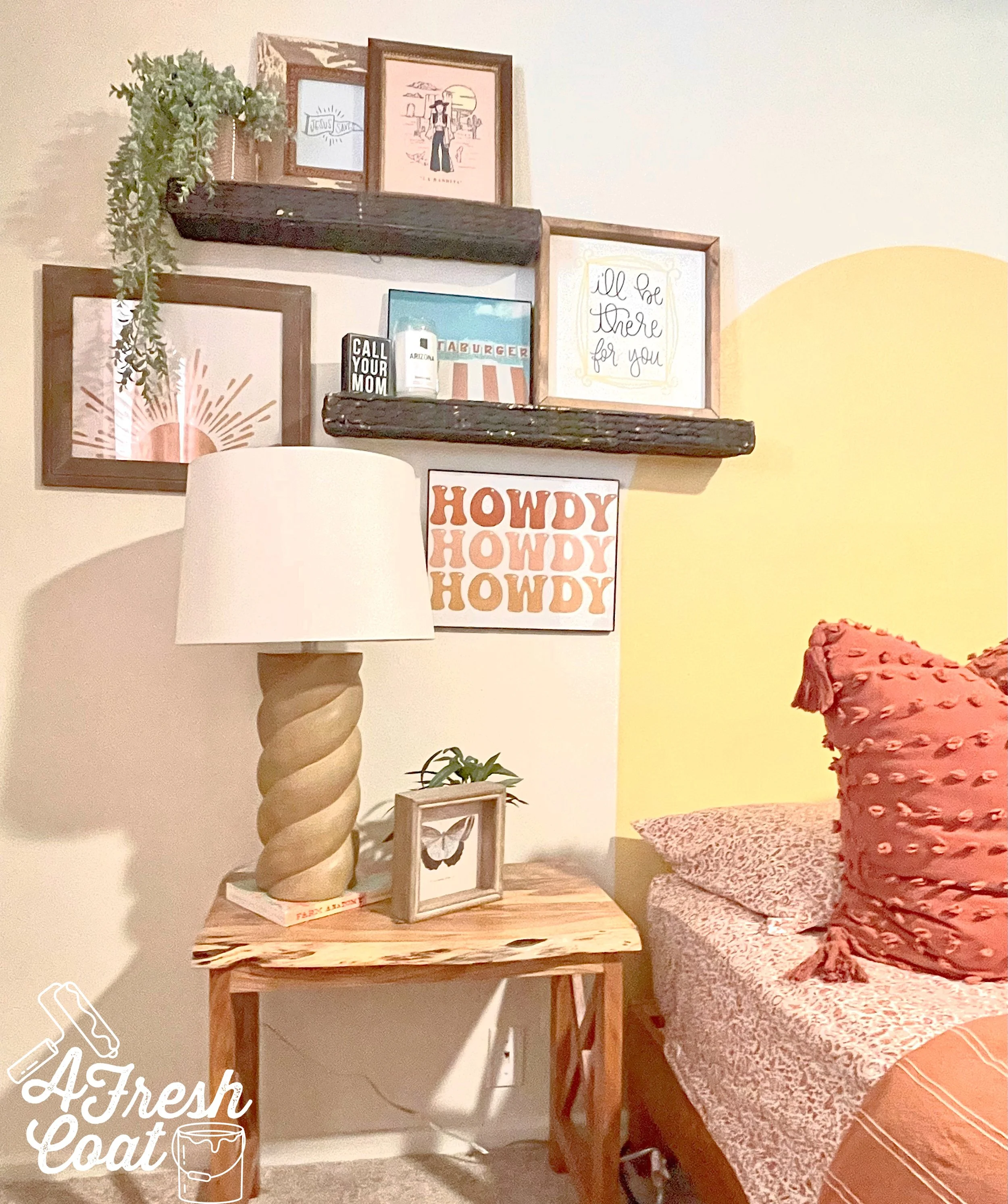
One of my favorite parts of Annie’s dorm room last year was the collection of artwork and photos we collected and curated prior to moving her in. We literally brought every piece over to this home and incorporated them all here.

We also added in an inexpensive live edge side table from HomeGoods, and that really cool lamp from Target to finish it off.

Next came the draperies.We scored these babies off of Amazon for super cheap and they worked perfectly! A crushed pink velvet with ties at the top to add a bit more femme to this space.

A really great live edge desk from World Market (on sale) fit the room perfectly as did the mustard yellow velvet desk chair I grabbed from Overstock to go with it.

Those items combined with a finishing touch—a Dalmatian print area rug and bam (!), this baby was done!

I love being able to do these projects for and with my girl…and I love her style.

Leaving Lubbock is never easy but the trips are never devoid of productivity, some serious shopping, and loads of fun.

THE DETAILS

Paint: Sherwin Williams Creamy

Paint Labor: A Fresh Coat-Yuma and Kari Bhana

Bedding: Target, Amazon

Throw Pillows: Target, Dandy Home & Ranch

Shelving: Dandy Home & Ranch

Lamp: Target

Wall Decor: Etsy, Target, Hobby Lobby, Rebel & Rove, Fearfully Made Creations

Desk: Cost Plus World Market

Side Tables: HomeGoods

Draperies: Amazon

Area Rug: Overstock

Desk Chair: Overstock

Ceiling Fan: Home Depot

Love, J


MASTER BEDROOM RESCUE & REVAMP

Master BedroomsJenny SulpizioComment

Like so many of us tend to do, my master bedroom found its way at the very bottom of the ole punch list. There were (and are) so many other projects I needed to address before this room, that this space was basically forgotten.

Until now.

This past summer I got bored (this can be dangerous), and decided to paint our master bedroom. About half-way through I decided I could no longer stand the carpet in there either. After talking to my husband, he (surprisingly) gave me the verbal “OK” to go cray-cray, and by the middle of the day, this room was half-painted and carpet-free.

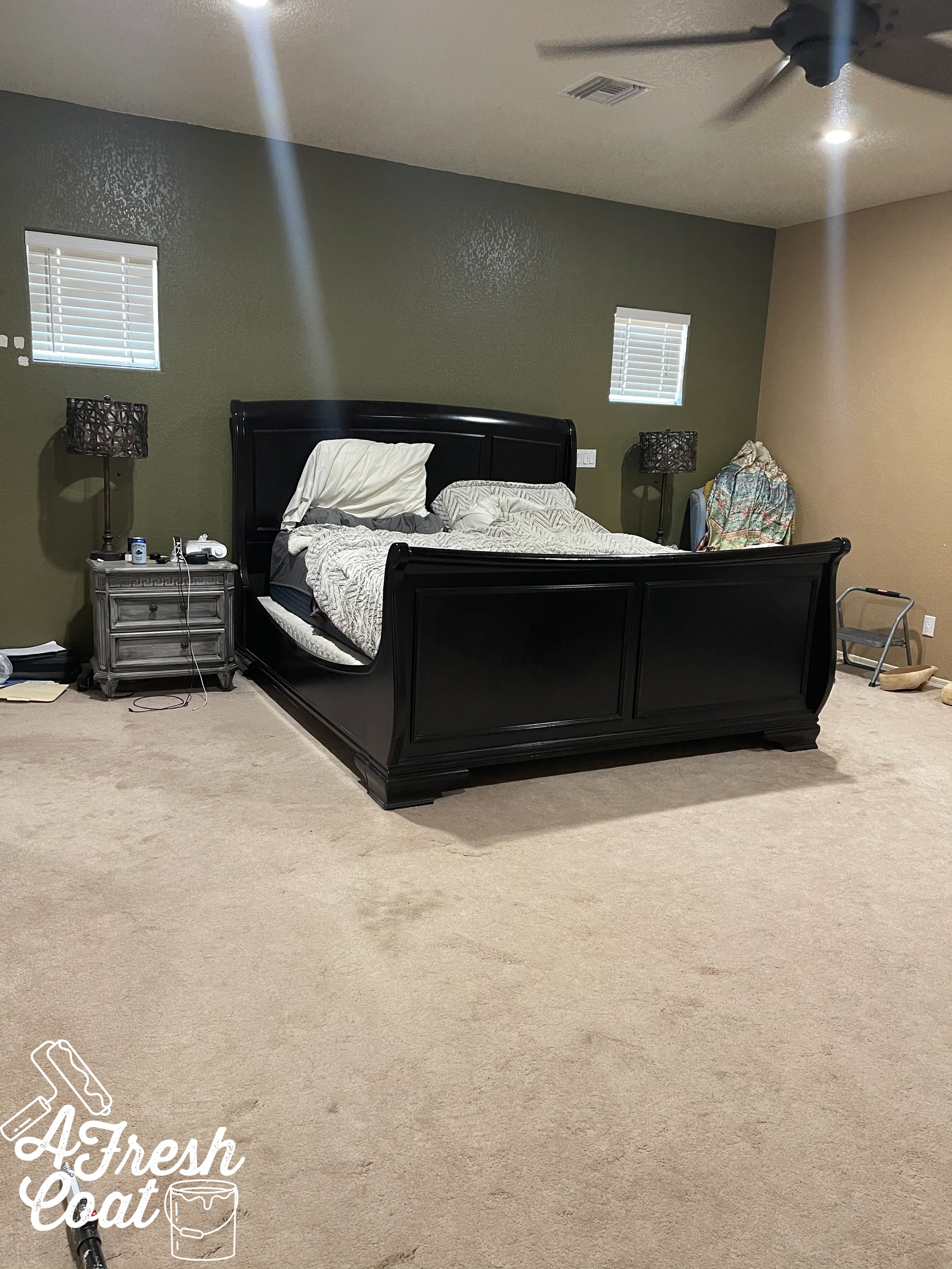
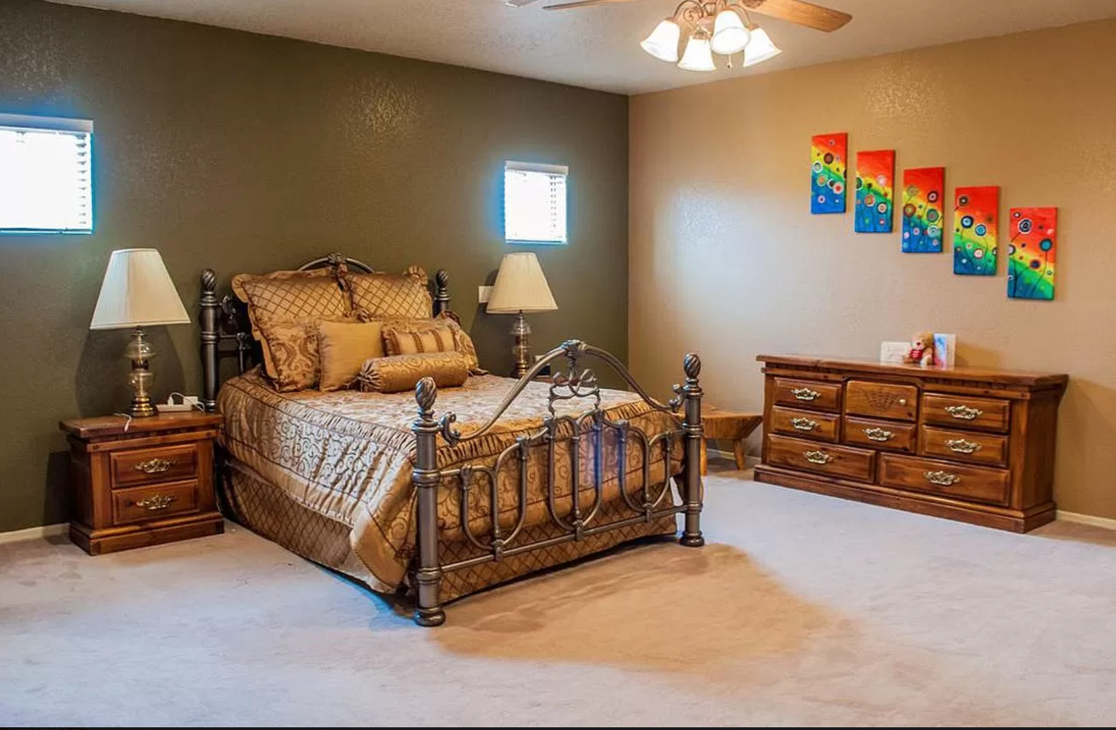
But before I get too far ahead of myself, here’s a glimpse of where we started:

I know, I know—not attractive in the least. The paint colors were outdated, as was the furniture, and well, basically everything in this room. The poor thing had been neglected for way too long.

She needed to be rescued…and revamped…and I had just the plan to do exactly that!

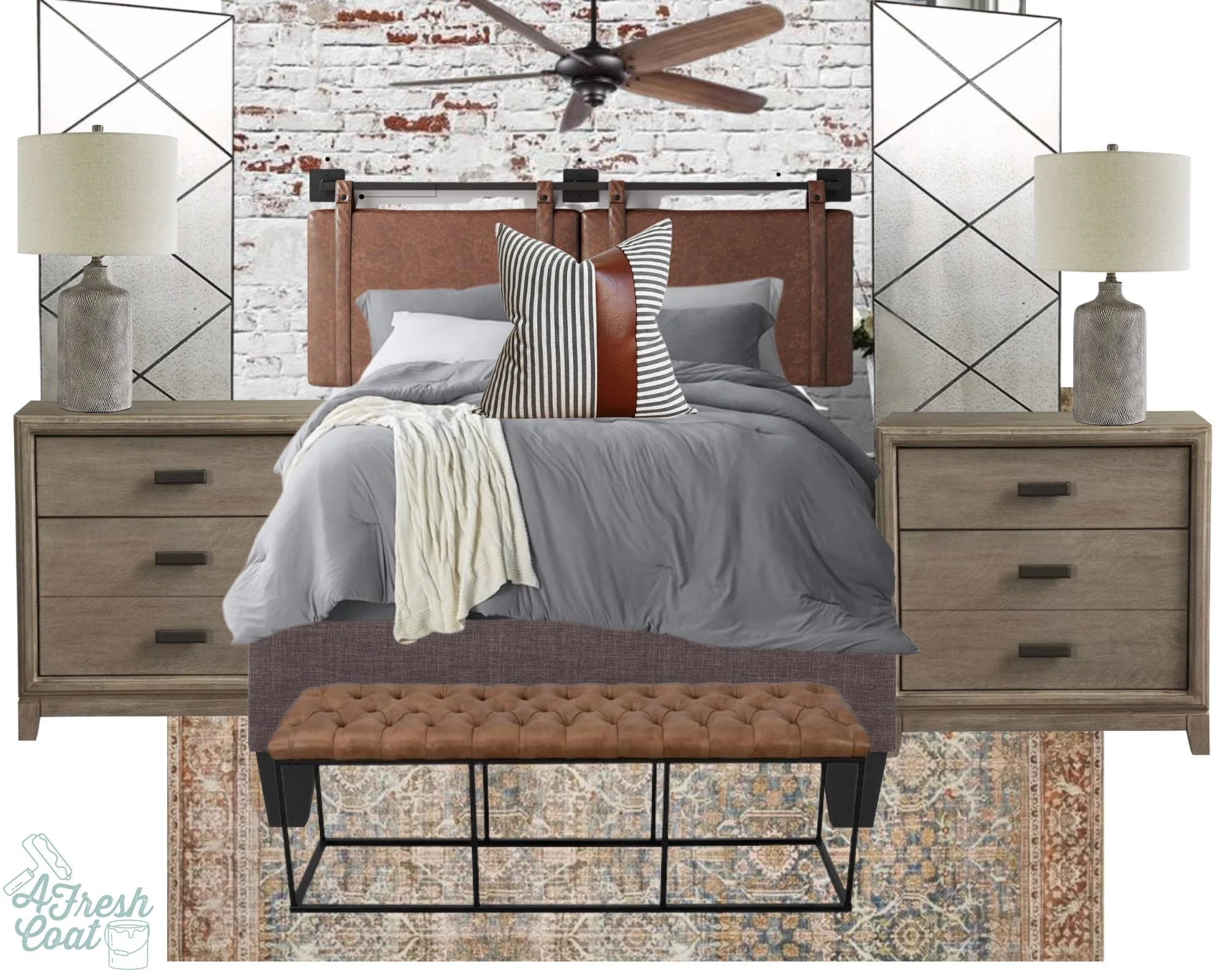
The goal was to take this space from drab to fab with a crazy small budget.

Initially I decided that I would JUST repaint this room in an effort to get rid of the ugly wall colors left by the previous homeowner.

I should take that back. I shouldn’t say another’s style is ugly. Let’s go with unattractive color choice. Much better.

After testing colors, I decided on Sherwin William’s Moderate White. And this is where my youngest son came in—however, after painting for a whopping two whole minutes, he was over it. D-O-N-E!

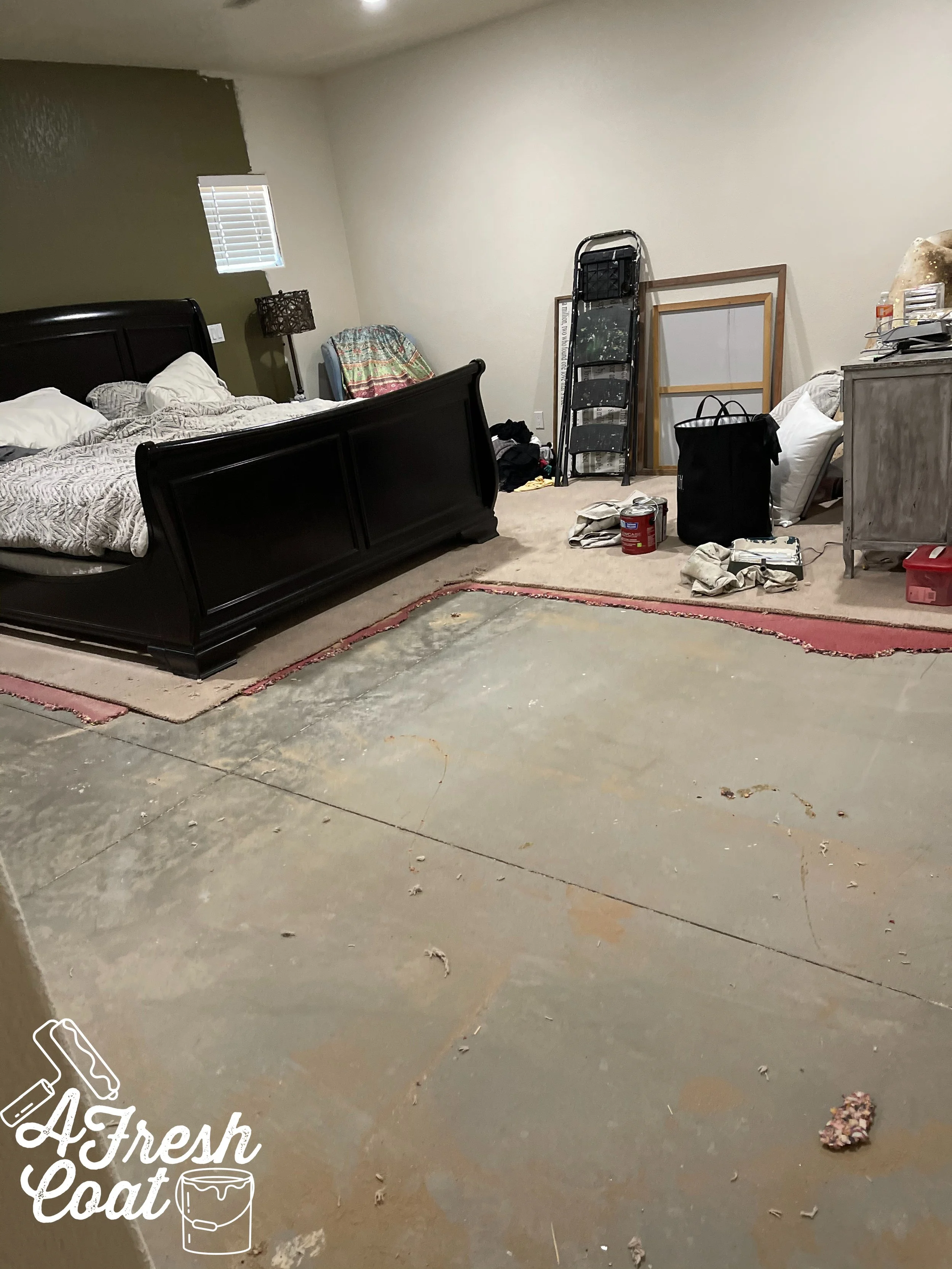
Once the walls were almost finished (by yours truly,) I decided I really hated the carpet. Well, one thing led to another, and the next thing I knew—the carpet was being ripped out.

Which escalated quickly…

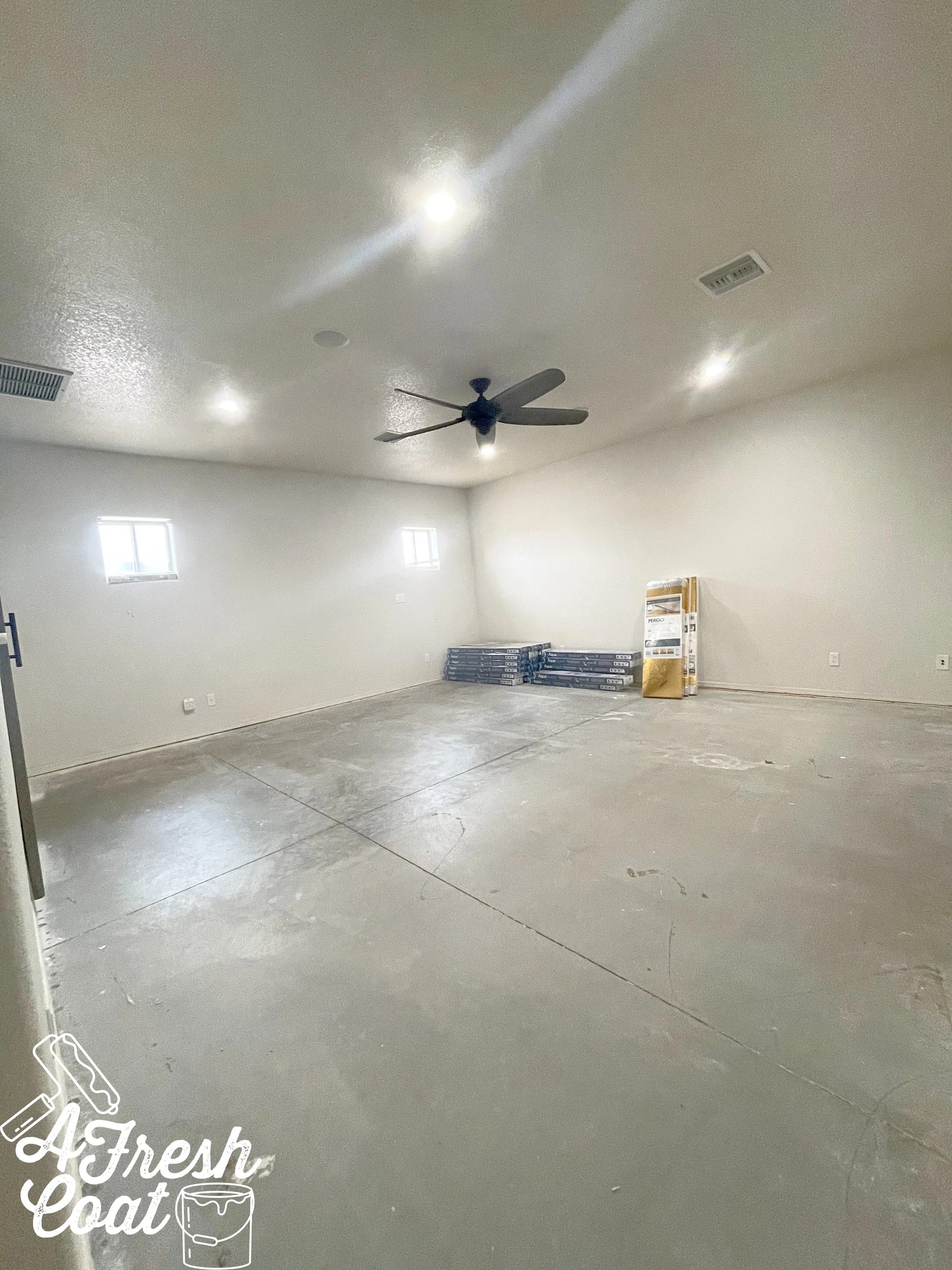
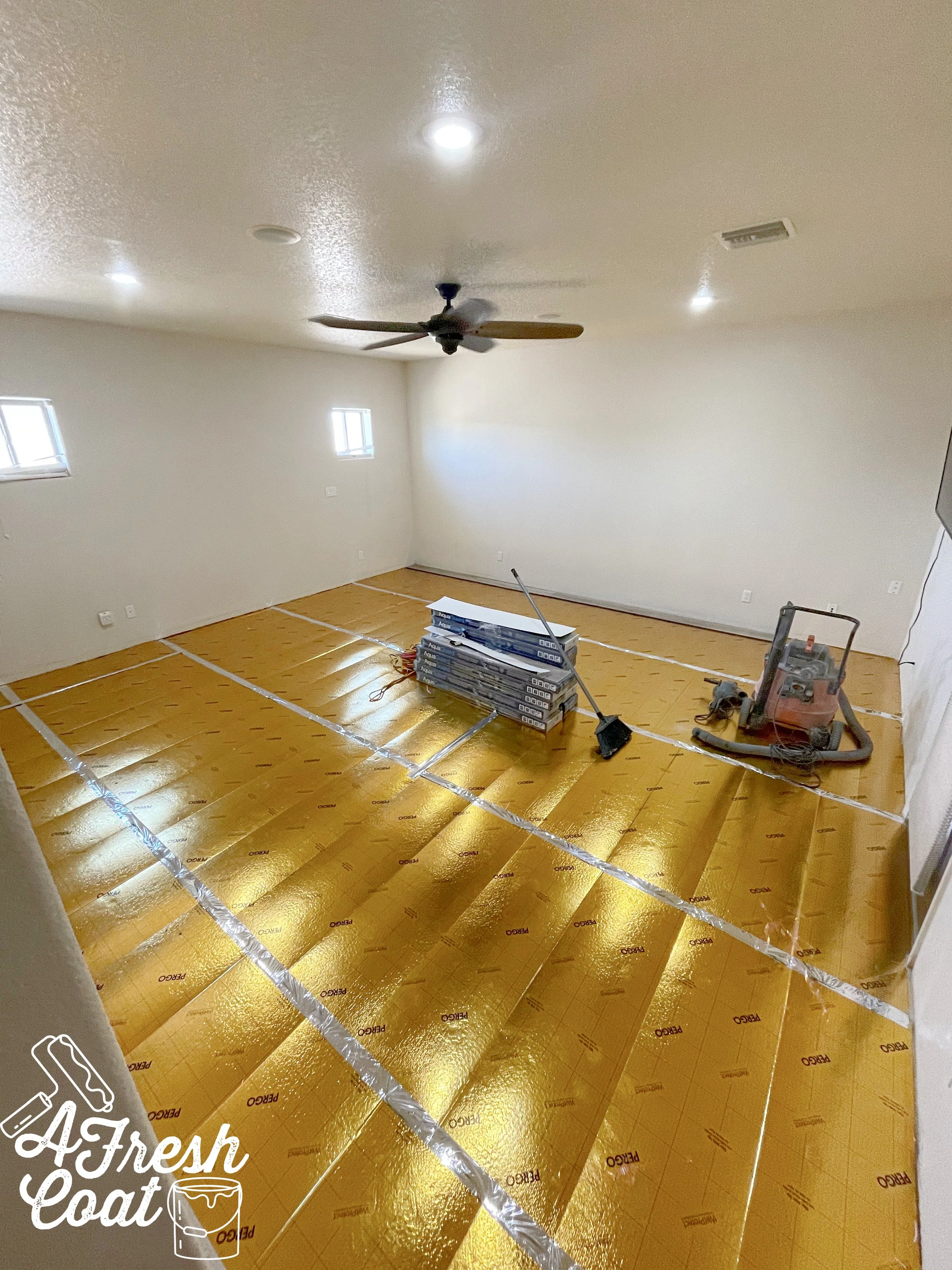
And see those boxes in the corner? This was the next dilemma we faced—what flooring should we choose? Our clearance wood tile flooring that we used out throughout the rest of our home wasn’t an option. We hadn’t planned on re-flooring this room, and so we didn’t order as much as we should have. Plus, it was no longer available (the dreaded “D” word: discontinued).

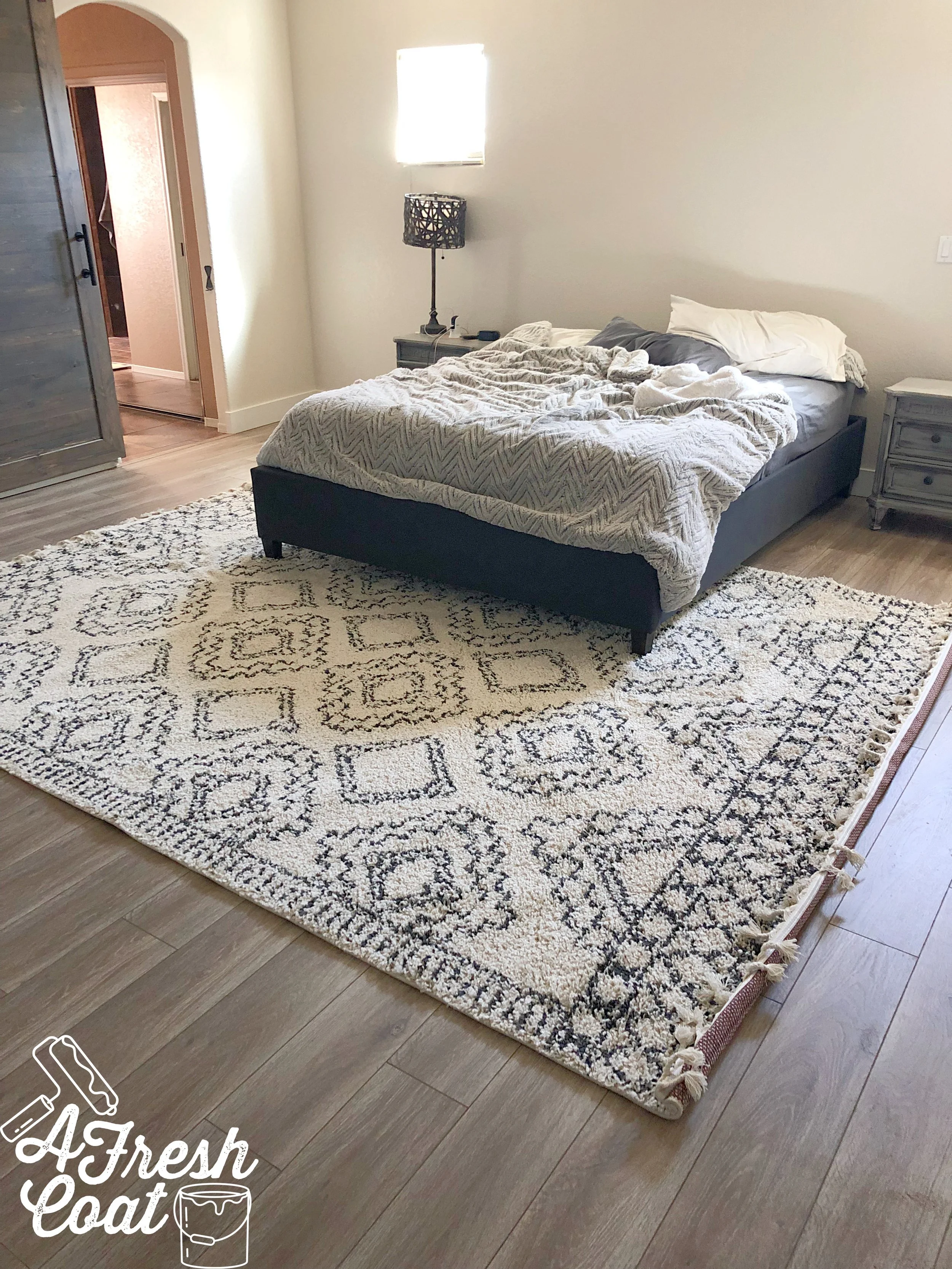
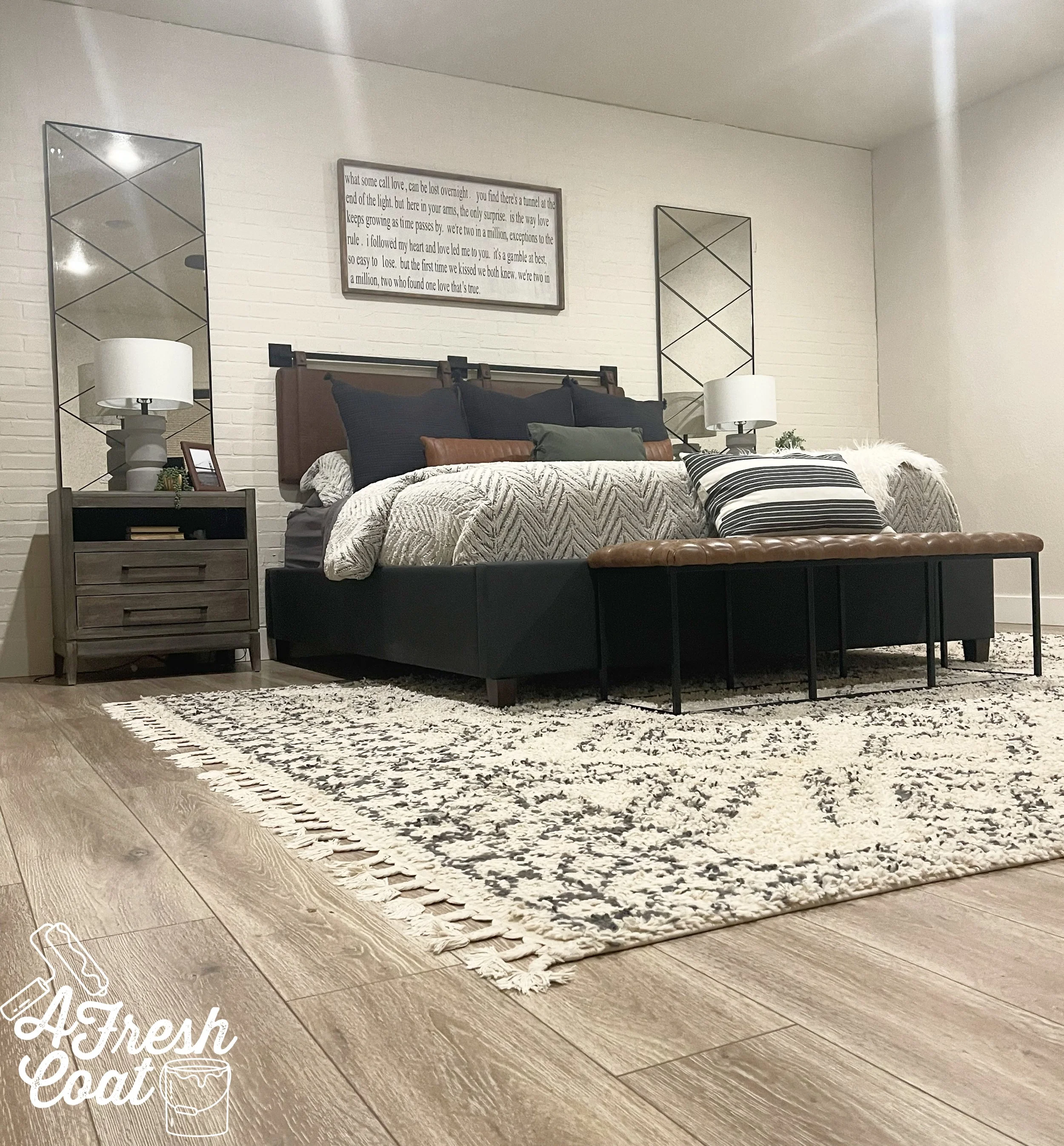
Luckily, we found an identical flooring option in laminate (not my fave), and ran up to Phoenix to grab it.

Already ten (thousand) times better…

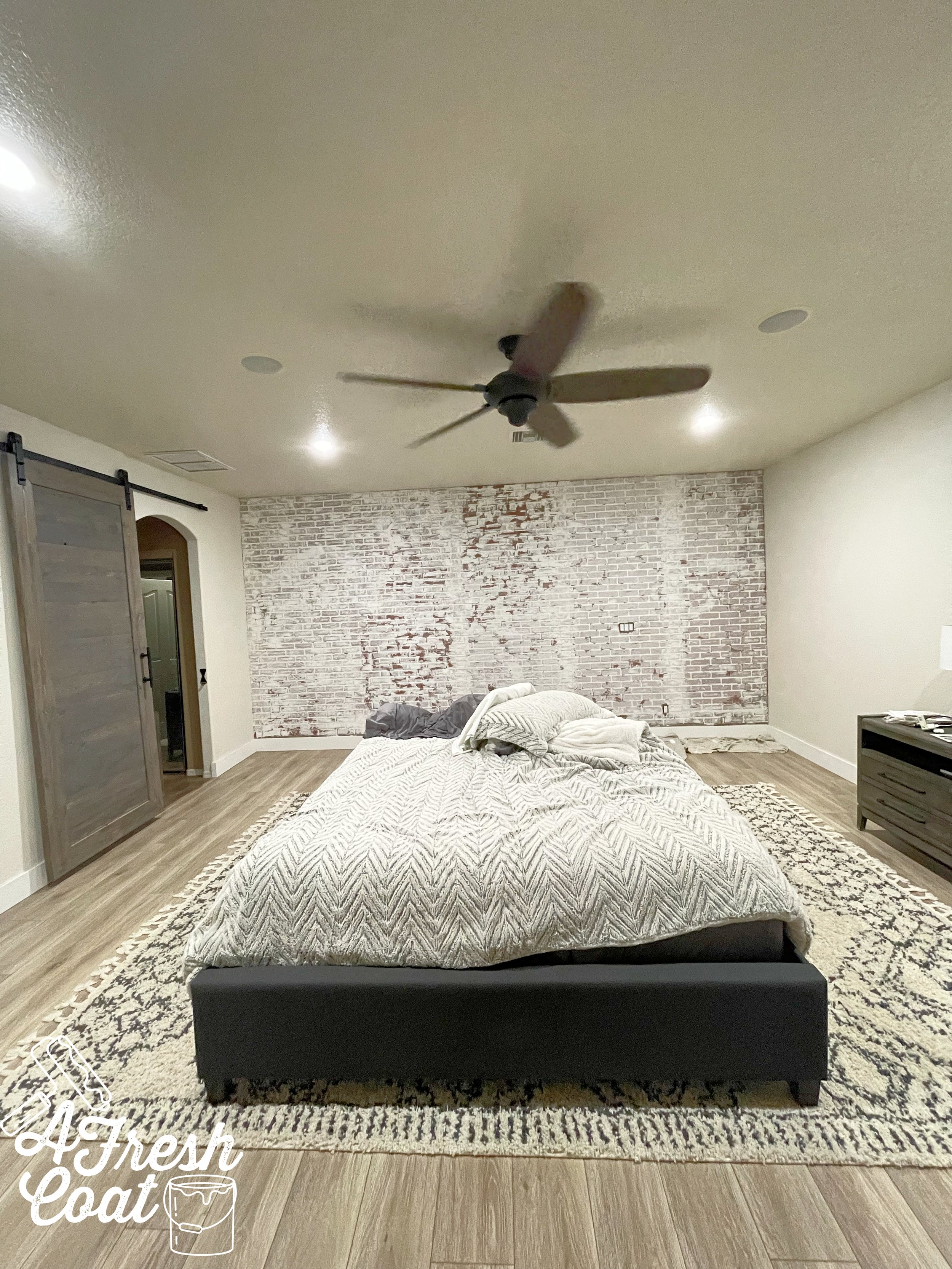
Progress! New flooring and a new rug, along with lighter and brighter paint made all the difference…but this space was far from done. F-A-R!

Now this is where it gets a bit controversial (LOL), because in this next step, you’ll see that we covered up the windows. When I mentioned this in my stories on the ‘gram, I got a bunch of questions as to why I would do such a thing. The answer? The windows were a really weird size. Like, weird-weird. As in—unattractive, non-functioning, can’t-do-anything-with-them kind of weird. They also weren’t spaced evenly. Besides, I had ideas of what I wanted to do in lieu of said windows, so away they went.

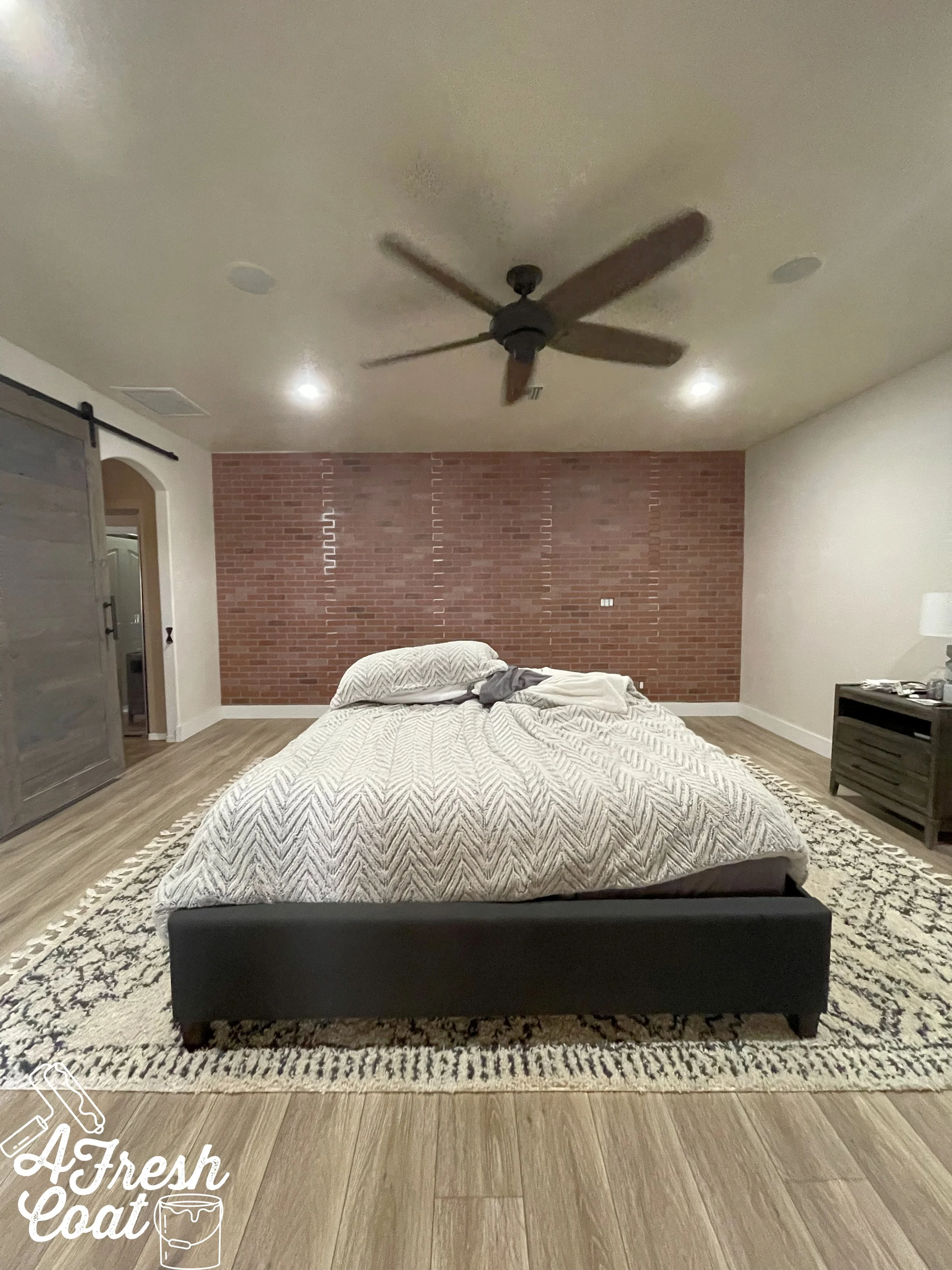
Brick wall panels for the win! Thanks to FSM Construction here in Yuma, this feature wall was up and looking stellar…but it still wasn’t done…not yet.

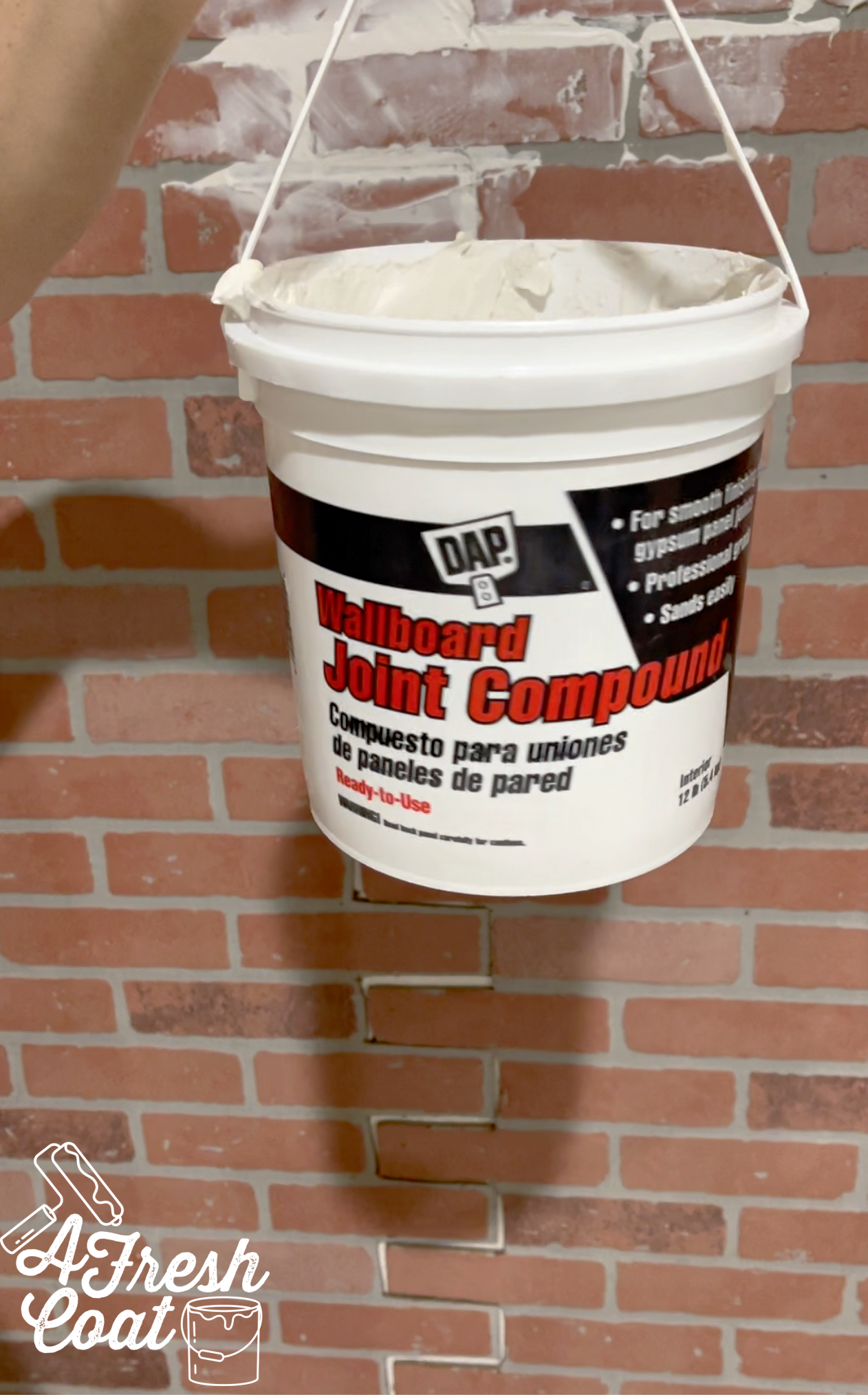
Next up? Joint compound…followed by paint. I wanted this accent wall to have texture and appear less urban, more modern farmhouse with a side of some desert flair. The joint compound helped to create a more uniform look and make the seams of the paneling disappear.

For the paint, I needed a creamy white as opposed to a bright white in order to achieve a warm overall feel to the room. Sherwin Williams Moderate White in Eggshell finish did the trick.

Almost there. Almost!

Now the waiting began—for the mirrors. After doing lots of homework and sourcing, I found the perfect pieces in the dimensions I needed…and the antiqued style I wanted.

But before the big reveal, here is the room exactly how it looked right before we moved into our home:

Photo courtesy of www.zillow.com

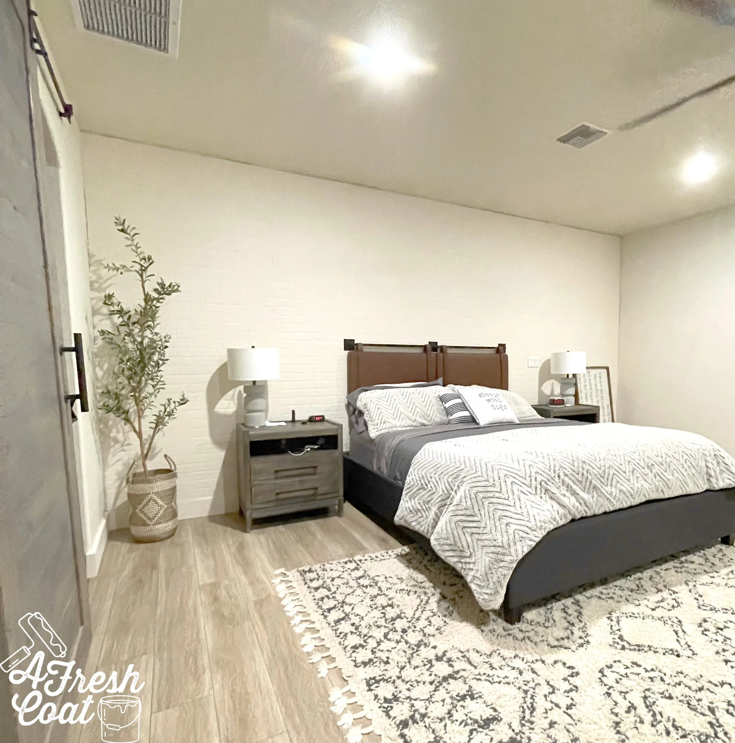
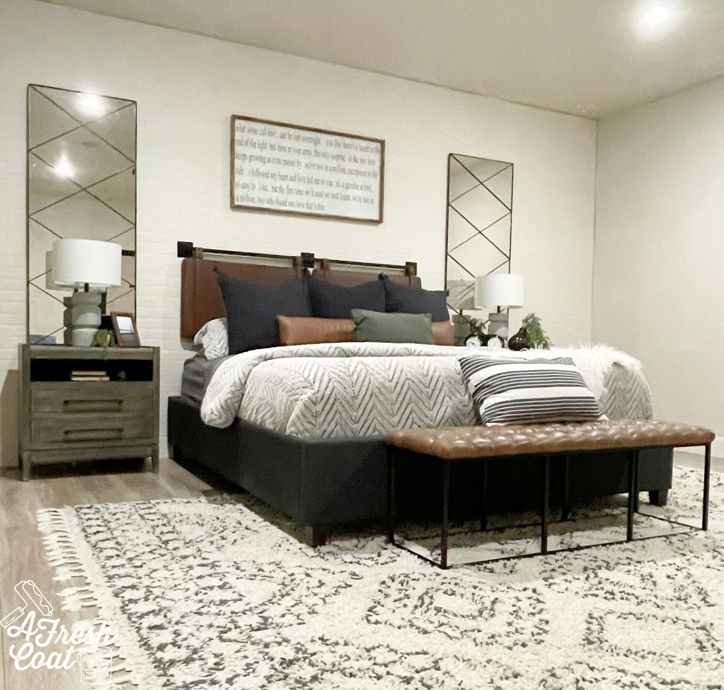
And now…

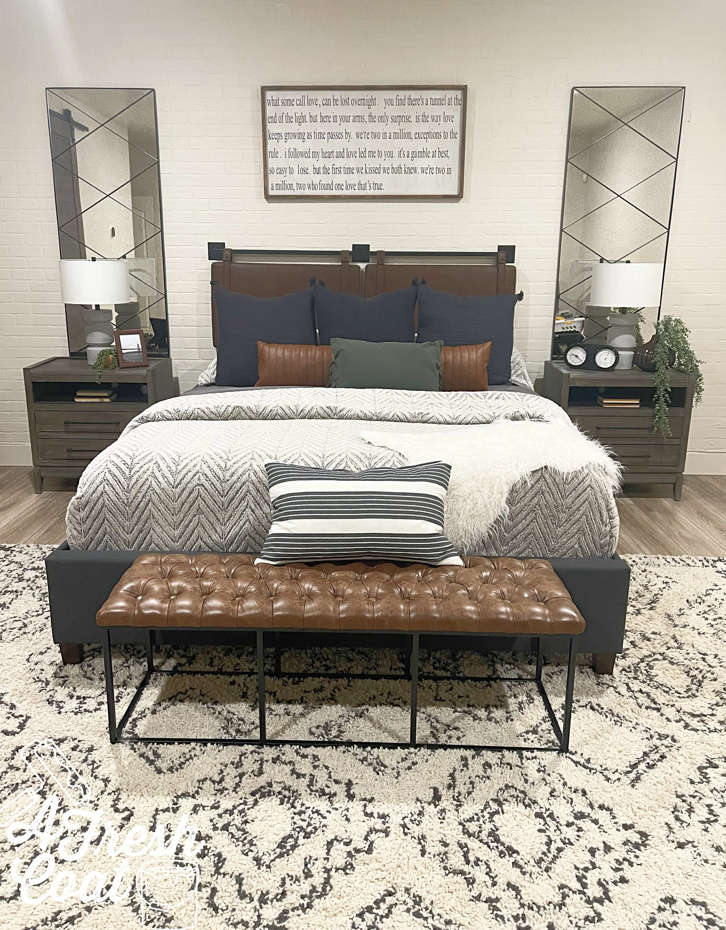
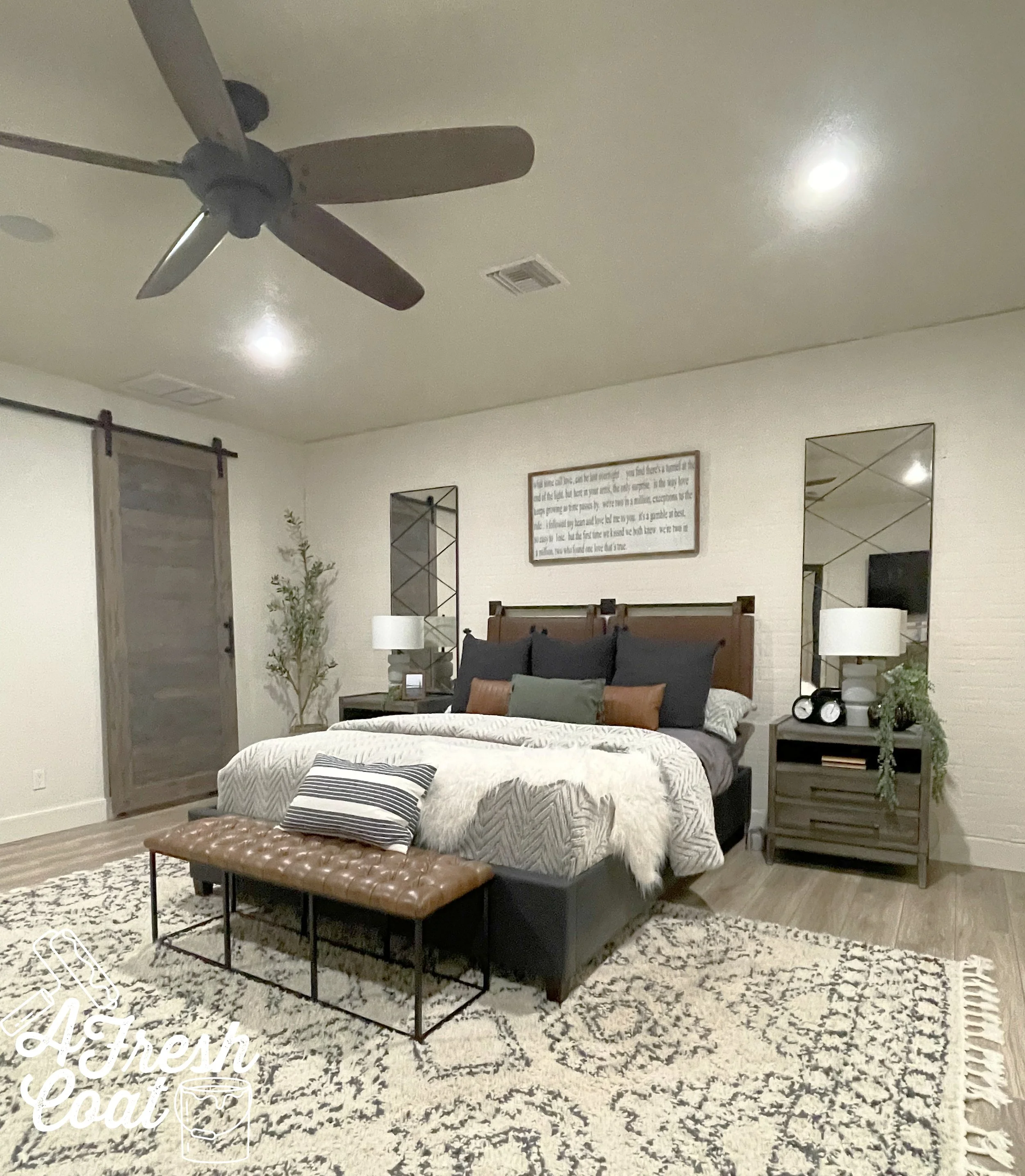
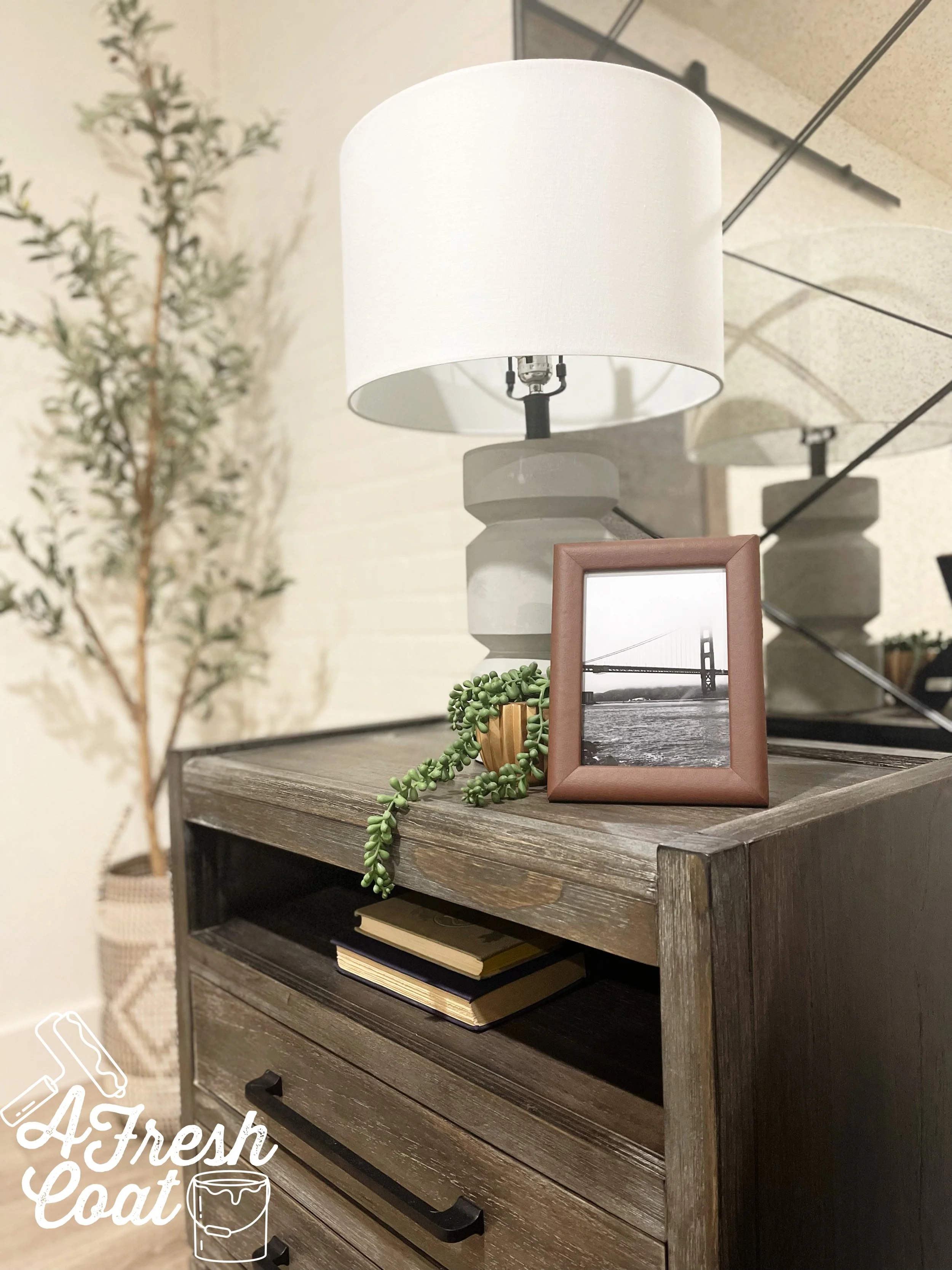
Bringing in new furniture, antique/distressed mirrors in lieu of our former windows, a brick textured wall, new bedding, and some added decor…and it’s D-O-N-E!

Tell me-is your Master Bedroom last on your list of to-do’s?

THE DETAILS

Paint: Sherwin Williams Moderate White

Paint Labor: A Fresh Coat Yuma

Design: A Fresh Coat Yuma

Brick Paneling: FSM Construction

Custom Barn Door: FSM Construction

Nightstands: Oak Tree-Yuma

Headboard: Amazon

Bed: Wayfair

Area Rug: Wayfair

Lamps: Wayfair

Mirrors: Dandy Home & Ranch

Bedding: Kohl’s/Target/Boll & Branch

Bench: Wayfair

Olive Tree: QVC

Decor: Goodwill/Target/Hobby Lobby

Love, J

BOHO BLUSH BEDROOM

Teen Girls RoomJenny SulpizioComment

As girls, do we ever really outgrow the color pink?

For me, it’s a hard “no." I mean, I kind of love pink, and I most definitely love decorating with it.

When the “L” family moved into their new home, they designated this bedroom for their youngest (teenage) daughter.

Photo Courtesy of www.realtor.com

Guess what?

This room was definitely NOT pink.

Nope. Not even close. It was green…and not the pretty green either (if you know what I’m saying).

So, I got to work and created this vision board for one of my favorite 8th graders—a room to last her through her next four years of high school…and beyond.

This proposal included beautiful pale pink walls, Boho elements in both furniture and bedding, and a really fun vibe overall.

When I say “fun vibe,” what I mean is that I would totally live in this room. Just to be clear.

After a little tweaking, here was the final result:

Custom made drapes using pre-made panels from Urban Outfitters (with matching bedding), a beautiful Boho rug, wall decor, and art prints.

New shelving from Dandy Home & Ranch, and a sweet vanity area perfect for any teenage girl.

A mixture of a few of her favorite things (and mine), to complete this sweet (and now customized) space.

One more before and after because, literally—it’s my favorite part!

BEFORE…

Photo courtesy of www.realtor.com

and AFTER

THE DETAILS

Paint Color: Sherwin Williams Rosy Outlook

Bedding/Draperies: Urban Outfitters, Pottery Barn Teen, Target

Area Rug: Urban Outfitters

Wall Decor: Walmart, Target, Etsy

Ceiling Fan: Shades of Light

Shelving: Dandy Home & Ranch

Decor: Hobby Lobby, Marshall’s, Goodwill, Target

Drapery Rods: Amazon

Love,

J

Boho Chic Teen Girl Room Makeover

Teen Girls RoomJenny SulpizioComment

This room.

This one right here?

It took almost two years to complete! TWO YEARS!

Sometimes clients can’t make up their minds. Other times, they change their minds mid-project which adds time and money to the original plans.

And then sometimes you have the toughest client ever…one you just so happened to also give birth to.

Ladies (and if there are any dudes reading this), gentlemen—Annie’s room is finally done! Finally! This girl almost killed me in the process thereof but it is finished…and I am so glad. Plus, I really love how it turned out so all the details are being shared below.

Here we go…

Boho Chic 1.jpg

For whatever reason, I cannot find my “before” pics from when we first moved in, but trust me when I tell you that the walls were ugly. Four textured walls in a pale (ish) yellow color that was anything but fun. So, we got to work.

I asked Nate Koogle to add interest by creating this feature wall of boxed moldings and he totally rocked it. AFC painted it SW Tricorn Black to add some “pa-pow” to the room. The remaining walls were redone in SW Snowfall, and the ceiling got a coat of bright white ceiling paint to top it off.

About mid-way into this makeover, we had a bug infestation. Like, a gross one. Annie had to vacate the room. Luckily it was contained but after ripping up her carpet, I decided that the flooring I eventually wanted to replace the rest of my home with, should go in there instead. And so it did.

Boho Chic 5.jpg

One thing was certain about this space: Annie wanted Boho. She loved the simplicity of a minimalist type of space with the freedom of style that Boho provides. The inspiration? The beautiful butterfly poster art we found at Dandy Home & Ranch. From this one piece we added in warm, bold colors of yellow (pillows and blankets) and Jade green (velvet European pillows).

Boho Chic 2.jpg

I found the wicker headboard from a friend locally, and the basic nightstands from IKEA (super cheap). Copper table lamps were purchased on clearance from Hobby Lobby and the bedding was found through Amazon.

If you look closer at the bedding in the top pic, you’ll notice the white pom fringe on the ends. I purchased black pom garland and had it added to to give a little more detail and contrast with the bedding. I love black pom garland anyways and I just think it kicks the bedding up a notch.

Boho Chic 4.jpg

Annie is a minimalist when it comes to her style (as mentioned earlier), and the other half of her bedroom represents this well. IKEA shelving extends in a single row all the way across the top of her South-facing wall. Plant hangers and pots accentuate the corner while a beveled mirror and basic white desk (Pottery Barn Teen) finish the space.

As for the large white wall in this area? Annie has a projector she connects her phone to in order to provide an instant (and super large) TV. That space will remain bare for her viewing pleasure.

Boho Chic 3.jpg

A modern but simple ceiling fan was added to complete the look. Ceiling fans are a must here in AZ and this one was just too fun not to purchase.

I love this girl to pieces but man, she gave me a run for my money. On to the next room…

The Details:

Paint: SW Snowfall (satin), SW Tricorn Black (satin), Valspar Ceiling Paint (flat)

Paint Labor: A Fresh Coat-Yuma

Feature Wall: Nate Koogle

Arched Window Shutters: Hardin Development

Bedding: Amazon

Throw Pillows: Target, Dandy Hopme & Ranch, Amazon

Throw: Target

Nightstands: IKEA

Table Lamps: Hobby Lobby

Wall Decor: Dandy Home & Ranch, Hobby Lobby, Target

Shelving: IKEA

Rug: Target

Ceiling Fan: Joss & Main

Shelving Accents: Junk in the Trunk

Accent Table: Pier 1

Love, J

House of Hockey...Room #2

Teen Boys RoomJenny Sulpizio26 Comments

Happy Thanksgiving! I am so greateful for all of my clients, past and present! I plan on consuming copius amounts of food today but in the meantime, here’s the second room makeover in the hockey home. Enjoy!

It’s time for little brother, “T’s” room reveal in the second installment of the House of Hockey dual room makeovers.

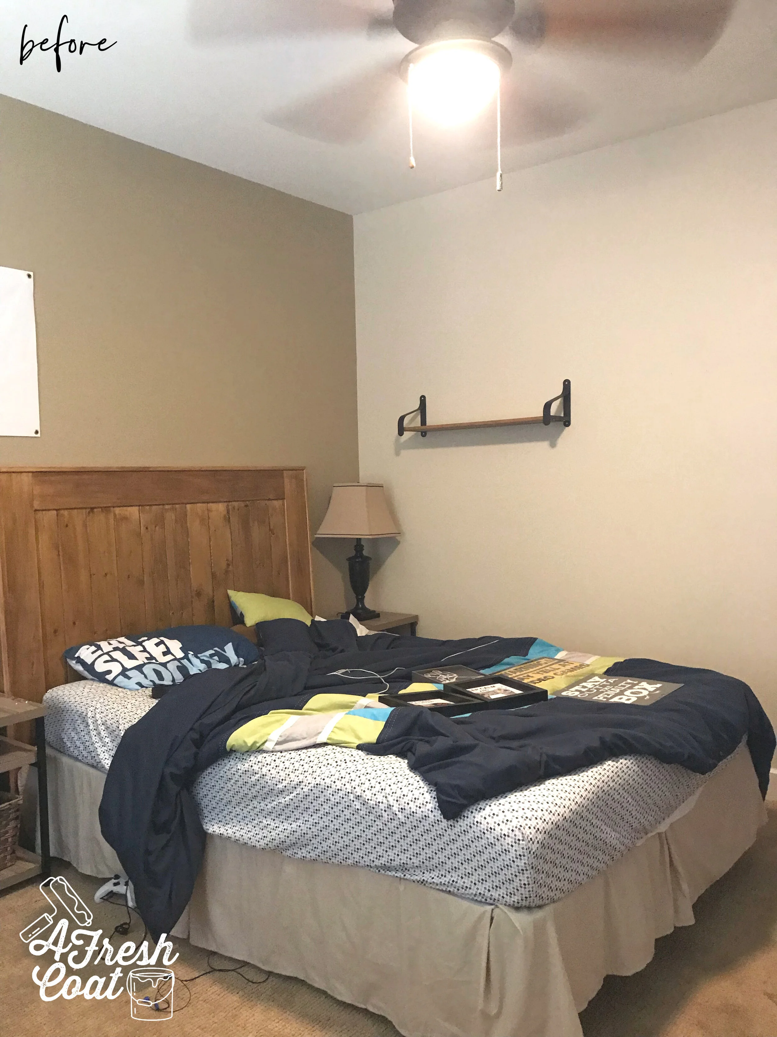
“T” is thirteen, a bit more reserved than his older brother, prefers neutral tones over color, loves hockey, and was in need of a room with more storage and a bit more style.

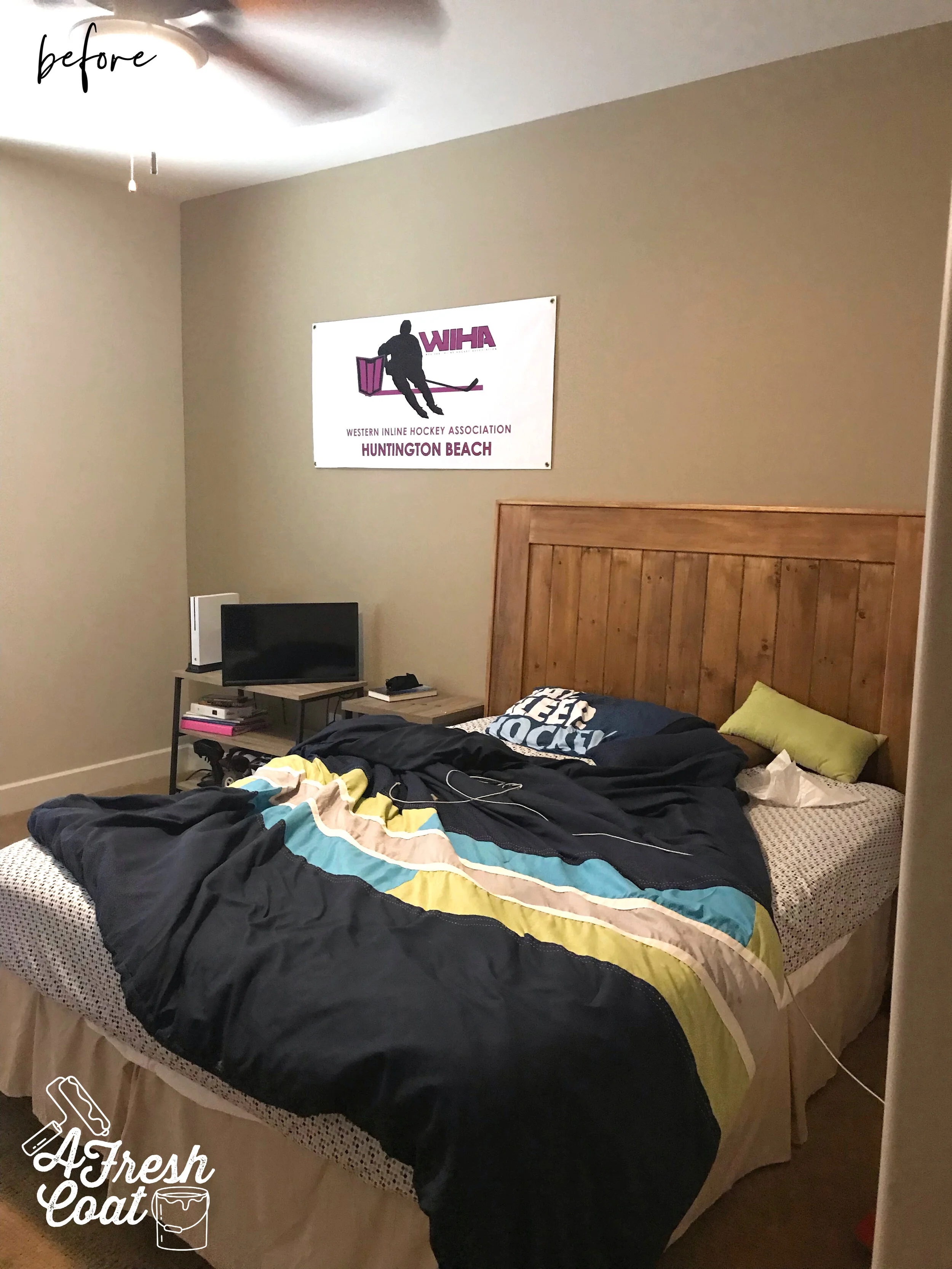
Here is where we started:

House of Hockey Room 2 1.jpg
House of Hockey Room 2 2.jpg

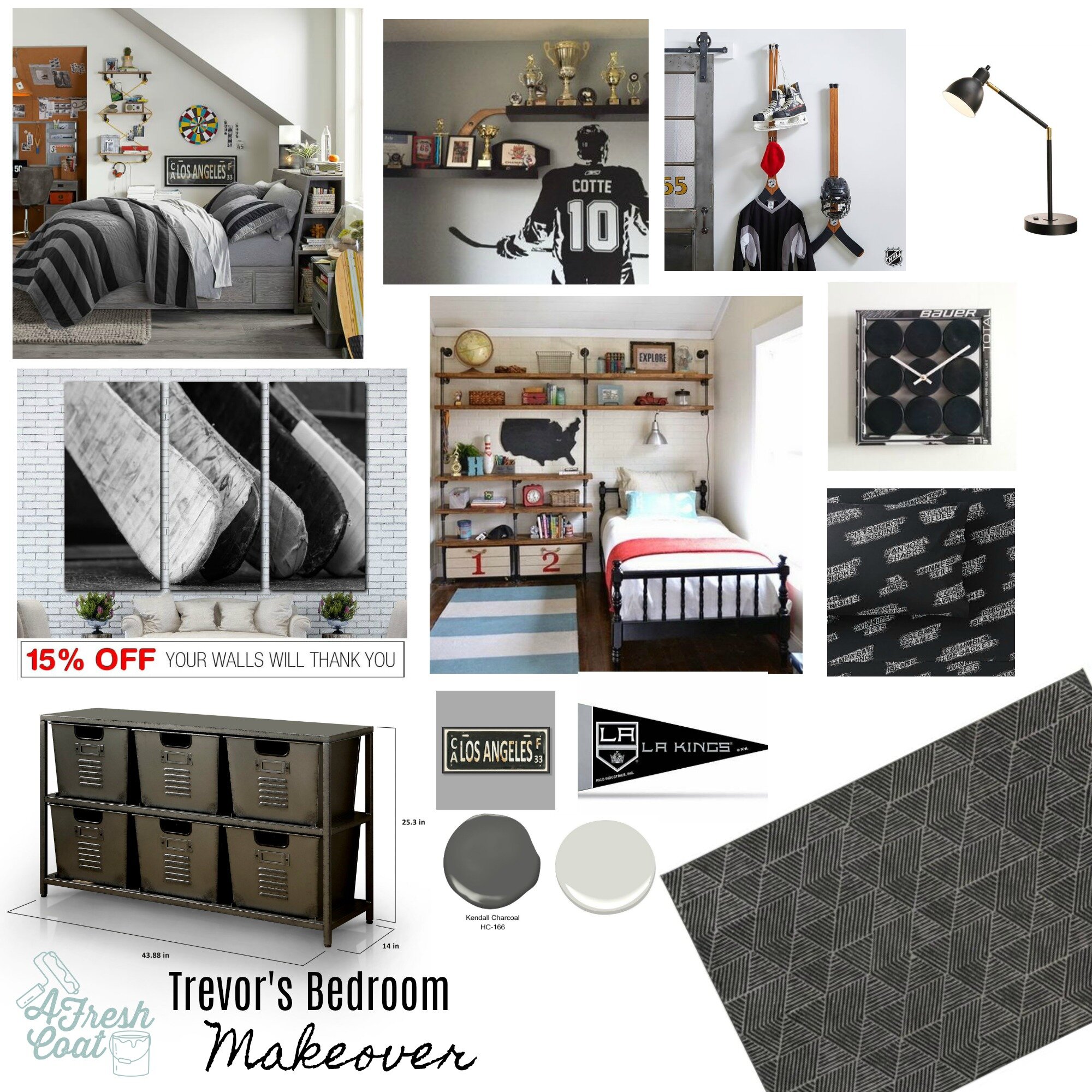
Another great space that just needed a bit more character. Here comes the vision board. Paint, wall decor, hockey accents, a sweet built-in storage unit, and new bedding would take this room to a whole ‘nother level.

Trevor's Bedroom.jpg

Using images from Pinterest to serve as inspiration, bedding from Pottery Barn Teen, and the colors of “T’s” favorite team—The L.A. Kings—this room was about to get redone.

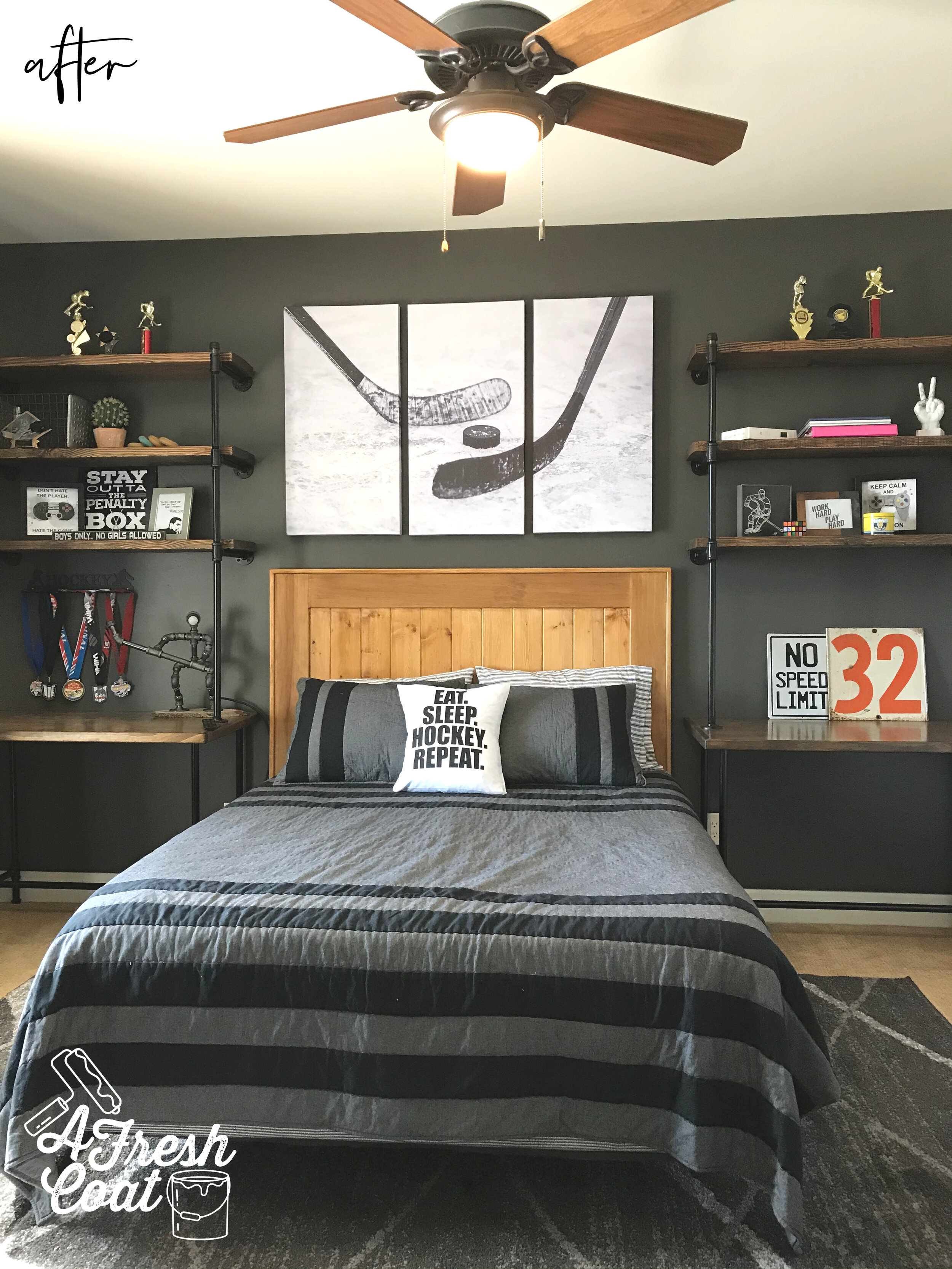
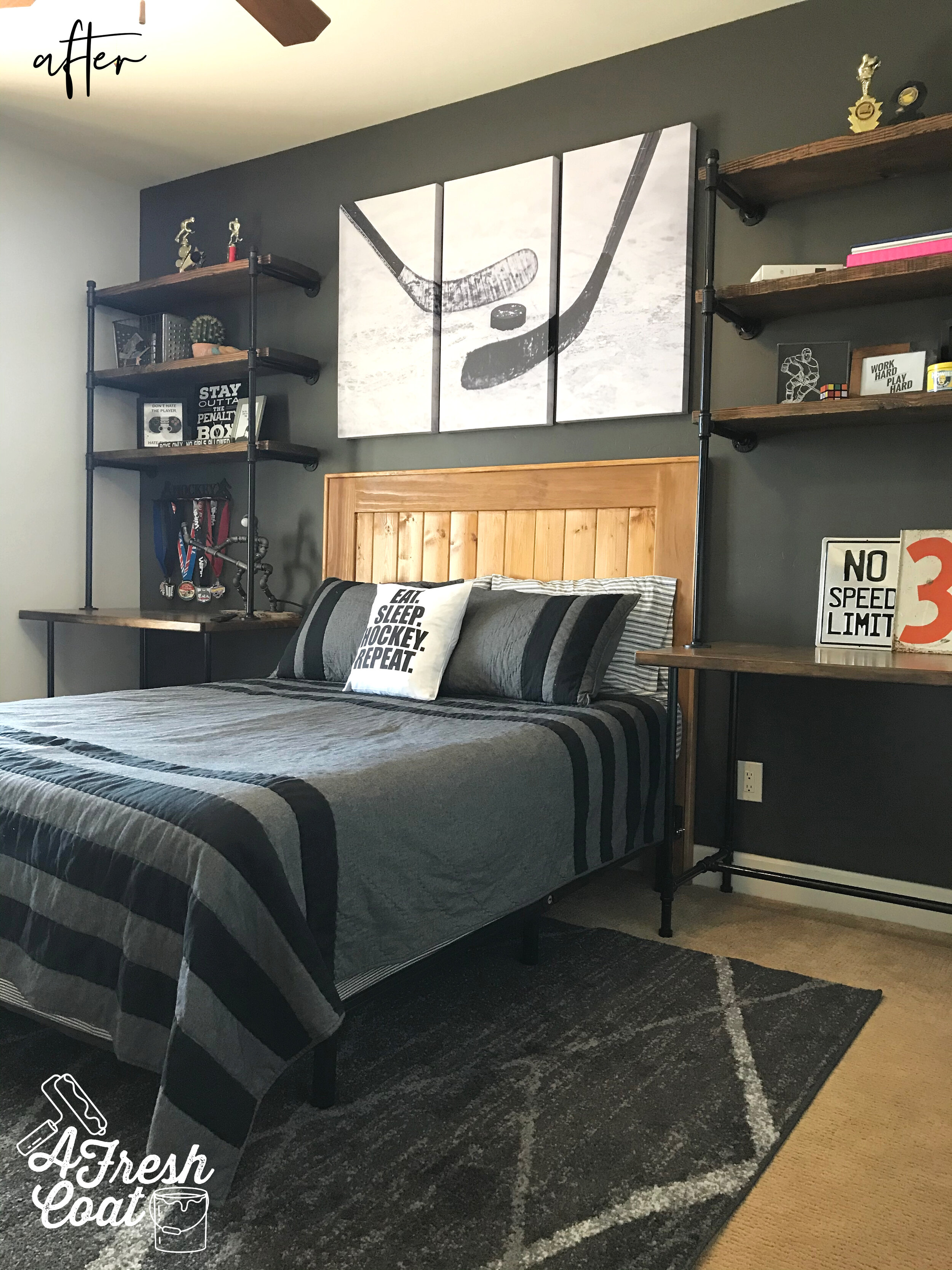
My first thought was to create an accent wall in this room as well, but with a slightly lighter hue of black called Iron Ore. It’s pretty much a charcoal color with a hint of brown added to it. This is quite possibly my new favorite color.

What do you think?

House of Hockey Room 2 3.jpg
House of Hockey Room 2 4.jpg
House of Hockey Room 2 5.jpg

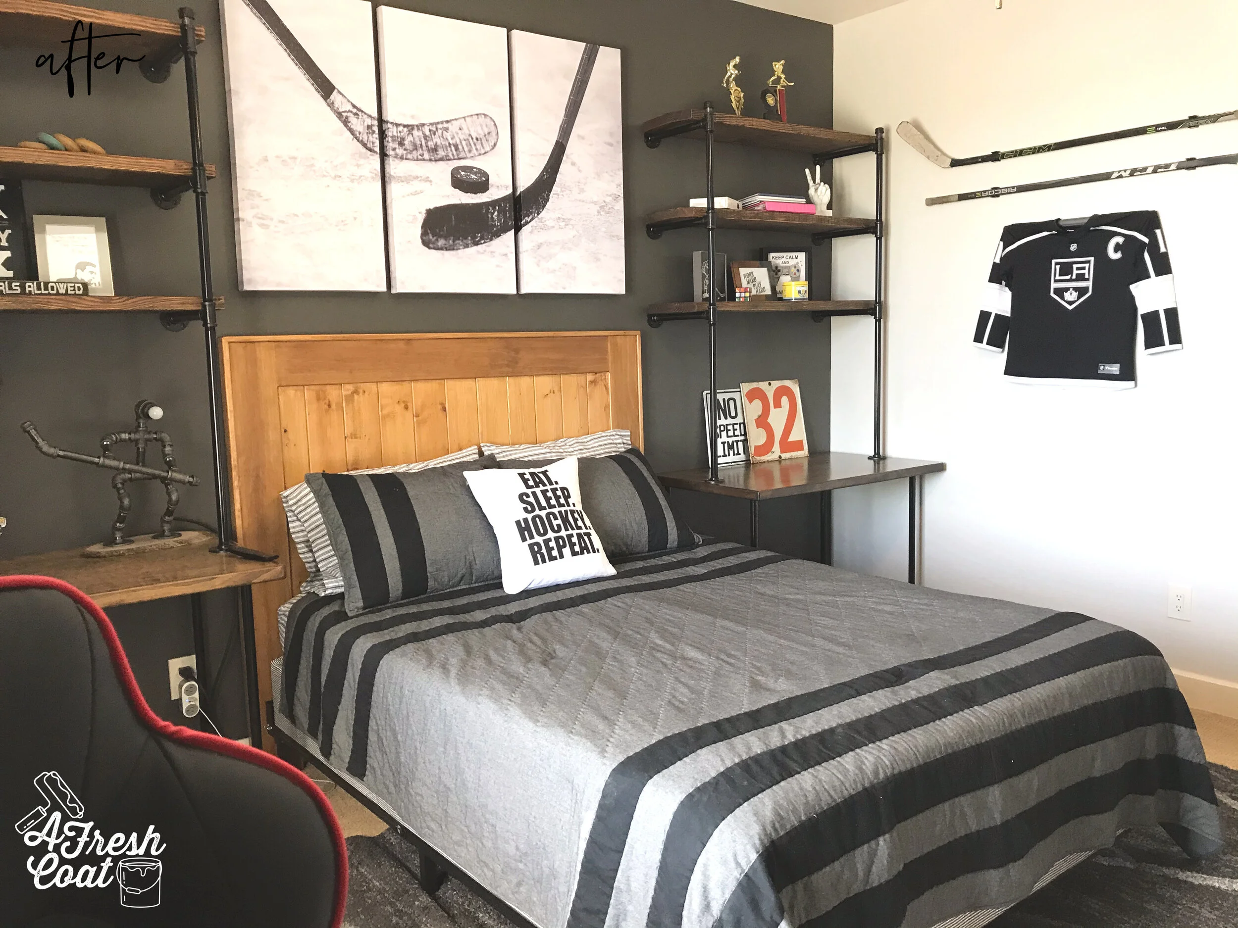
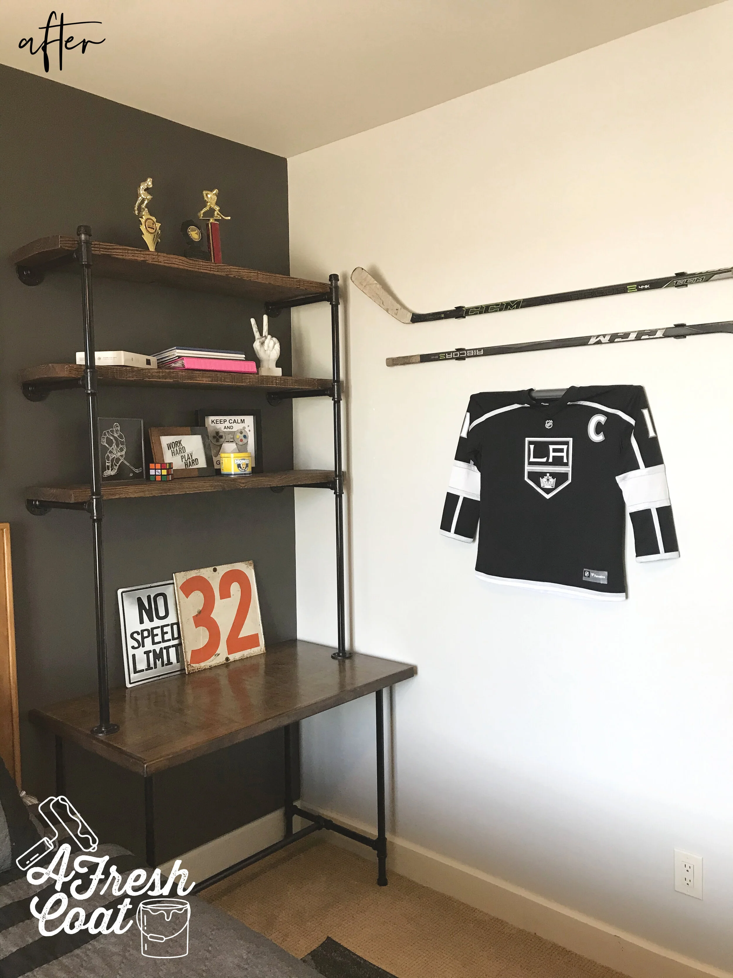
This room really has the “wow factor” now. The amazing industrial wood shelf and pipe units are so striking up against that charcoal wall (thanks, Nate Koogle). The series of canvasd arts offer a bright, yet simple area for the eye to land, and enough contrast so that the room doesn’t look smaller.

You might of noticed (and this was intentional), that each of these rooms only has one throw pillow. When working with teenage boys, one thing is certain: they do NOT have the innate need to express themselves through throw pillows. Girls are another story, and the more pillows the better. But guys? No. One pillow and I’m lucky to get that. LOL

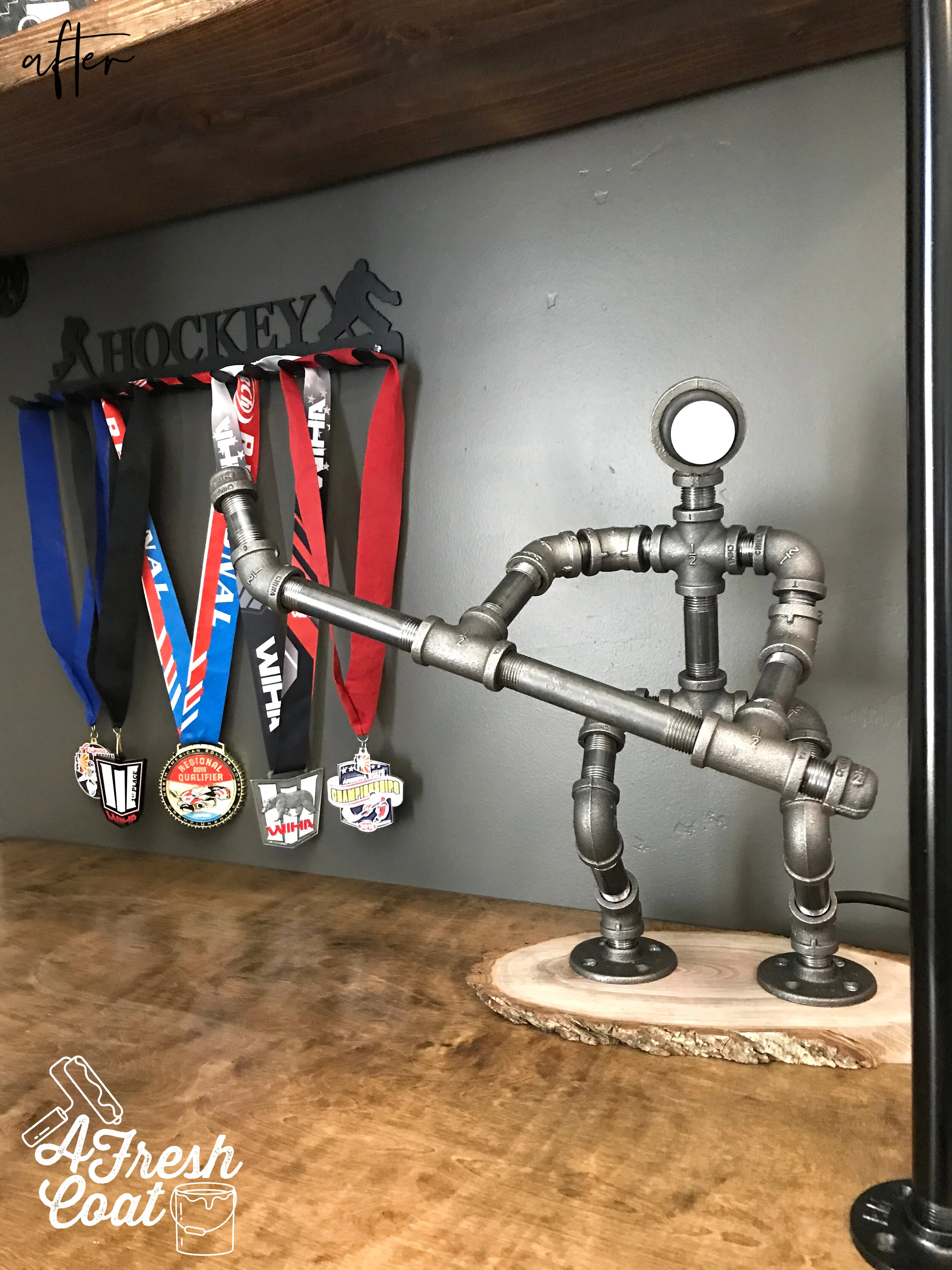
Oh! And did you spot that super cool lamp up above? Here it is up close:

House of Hockey Room 2 6.jpg

“T’s” mom found this on Etsy and I absolutely love it. The little details are what truly make a room and bring it to life. This piece is not only fun, but oh-so-creative. How ‘bout those hockey medals on display too? They pop off of that wall and really stand out.

One more shot…

House of Hockey Room 2 7.jpg

When styling these shelves, we kept it super simple. Trophies, a fave number, and a few decor items and that was all. Simple is (almost always) better.

Here’s the transformation one more time:

House of Hockey Room 2 2.jpg
House of Hockey Room 2 3.jpg

The Details:

Bedding: Pottery Barn Teen

Wall Decor: Etsy, Hobby Lobby

Paint: SW Iron Ore, SW Agreeable Grey

Paint Labor: A Fresh Coat

Rug: Wayfair

Throw Pillow: Etsy

Hockey Triptych: Etsy

Industrial Pipe Units: Nate Koogle

Love, J